


Food trucks and pop-up kitchens have become culinary staples in cities across the globe. Whether you’re serving gourmet grilled cheese or handcrafted boba tea, one essential ingredient to your brand’s success is a memorable logo. Not only does your logo represent your cuisine’s personality, but it also becomes your visual handshake with hungry passersby. Crafting the right logo can help you attract attention, communicate your concept, and leave a lasting impression.
TL;DR
Your food truck or pop-up kitchen logo is the face of your business, and it should reflect your concept, cuisine, and character. From minimal watercolor designs to bold vintage emblems, we’ve compiled 12 outstanding logo ideas to inspire your brand. Consider the tone of your food, your audience, and your vibe when picking or designing your ideal mark. A killer logo not only attracts eyeballs—it whets appetites too!
1. Retro Diner Aesthetics
If you’re slinging burgers, shakes, or nostalgic comfort food, a retro diner logo might be your perfect match. Think vibrant reds, pastel blues, chrome finishes, and 1950s-inspired typography. These designs hint at American tradition and classic flavor while being visually delightful and easily recognizable. For added flair, include a neon sign effect or checkerboard pattern.
2. Minimalist Modern
Minimalist logos are sleek, contemporary, and well-suited for trendy pop-up kitchens and urban eateries. These designs often rely on simple geometric icons, monochrome colors, and clean sans-serif fonts. They’re ideal for brands targeting health-conscious, design-savvy customers or high-concept cuisine.
Take inspiration from Scandinavian design or Japanese bento box simplicity—less is definitely more in this case.
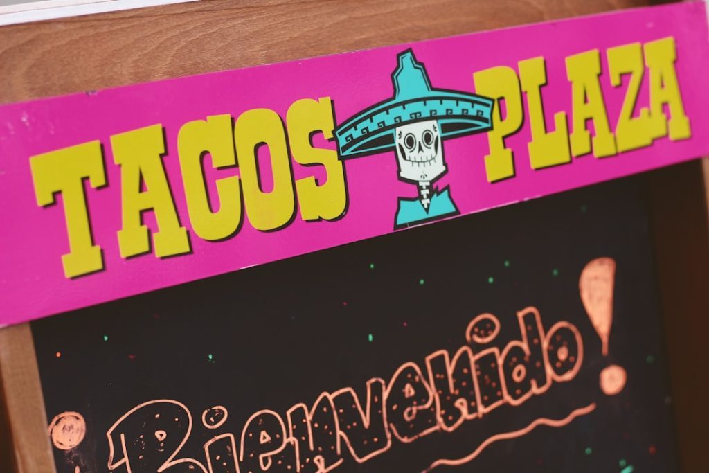
3. Hand-Drawn Characters
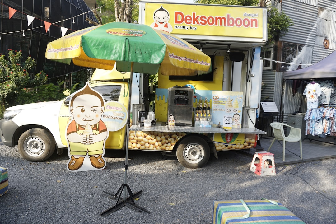
Add a personal touch with a hand-drawn mascot or character associated with your food offering. Whether it’s a smiling taco, a mischievous noodle bowl, or a punk-rock donut, these whimsical icons bring humor and friendliness to your brand. They work especially well with food aimed at families or younger audiences.

4. Street Art Style
Banksy meets burritos. Urban food scenes thrive on creativity, and bold, graffiti-inspired typography and illustrations can give your brand a serious personality boost. Using spray paint textures, stencil art, or gritty lettering brings an edge to your presentation—perfect for a food truck that dares to be different.
5. Vintage Emblems
Think of old butcher shops, speakeasy menus, or heritage farm packaging. Vintage emblem logos give the impression of quality, authenticity, and a timeless approach to food. These often include circular badges, ornate borders, and serif fonts.
They’re great for barbecue, deli, or artisanal vendors aiming for a rustic or industrial feel.
6. Playful Typography
Can the name of your food truck double as the logo? Absolutely. Some of the most effective branding simply involves expressive, bold typography. Typographic logos rely on custom lettering that mirrors your food’s attitude—funky fonts for dessert trucks, elegant cursive for tea stands, chunky fonts for belly-filling comfort food.

7. Watercolor & Organic Themes
Logos with watercolor touches and earthy tones work beautifully for plant-based, farm-to-truck, or natural food vendors. These logos often incorporate leaves, fruits, or natural textures in a free-flowing artistic style. They convey sustainability, freshness, and a homegrown vibe.
Pair with lowercase typography and soft, muted hues for a calm and inviting look.
8. Global Flavors
If your food has international roots—whether it’s Thai street food or Jamaican jerk chicken—let your logo reflect that cultural richness. Use design motifs, symbols, and colors native to your cuisine’s origin.
For example, a taco truck could feature Aztec patterns, while a noodle stand might include East Asian ink brush lines. Be sure to use cultural elements respectfully and authentically to represent the region you’re celebrating.
9. Icon + Wordmark Combo
This type of logo always packs a punch. By combining a unique icon (like a stylized dumpling or rolling pin) with a well-designed wordmark, you get a versatile logo that can work in various contexts—banners, uniforms, menus, and social media avatars.
This combo is a solid pick for businesses that want instant recognition combined with brand clarity.
10. Illustrated Food Portraits
Put your dish front and center—literally. Creating a detailed illustration of your signature item (be it a loaded burrito or an epic cupcake) ensures instant clarity about what you’re serving. This can be hyper-realistic or stylized depending on your brand’s tone.
Pro tip: Make sure the image is scalable and recognizable even at smaller sizes, like on social media icons.
11. Geometric Patterns
Using repeating geometric shapes or abstract forms can modernize your logo while adding visual interest. These patterns work best when fused subtly into the background or border of your main logo symbol. When done right, it creates an eye-catching logo that feels polished and professional.
Popular choices include mandalas, triangles, or circular motifs—especially effective for fusion food or experimental cuisine.
12. Monoline or Line Art Logos
Monoline logos—entirely drawn from lines of the same thickness—create a sleek and balanced aesthetic. These logos are especially powerful when used in sophisticated or upscale food truck branding. They’re elegant and clean, with minimalist elements that can depict anything from utensils to ingredients to vehicles themselves.
Why Your Logo Matters
Your logo acts as an ambassador long before customers taste your food. A great one:
- Appeals to your target demographic
- Matches the personality and tone of your food
- Helps your truck stand out in crowded settings
- Looks professional and trustworthy
- Is versatile across signage, packaging, and social media
With the food truck industry booming, first impressions matter more than ever. The right design can turn a curious bystander into a loyal customer.
Tips for Creating Your Food Truck Logo
- Know your audience: Kids, foodies, office crowds—all respond to different visuals.
- Choose 2–3 brand colors: Consistency is key for strong branding.
- Test for readability: Your logo should be legible from a distance and in small sizes.
- Keep it simple: Overly complicated logos can be hard to reproduce and recognize quickly.
- Work with a designer: Invest in professional help for a polished final result.
Conclusion
From vintage to modern, whimsical to refined, your food truck’s logo plays a vital role in your business success. It transmits flavor, personality, and professionalism before your first dish even hits the grill. The logo styles listed above are just jumping-off points—blend them, tweak them, and shape them into something that uniquely reflects your edible enterprise.
So the next time you open that service window, make sure your logo is doing its share of the work—drawing people in, building curiosity, and leaving customers with a taste of your brand they can’t forget.