


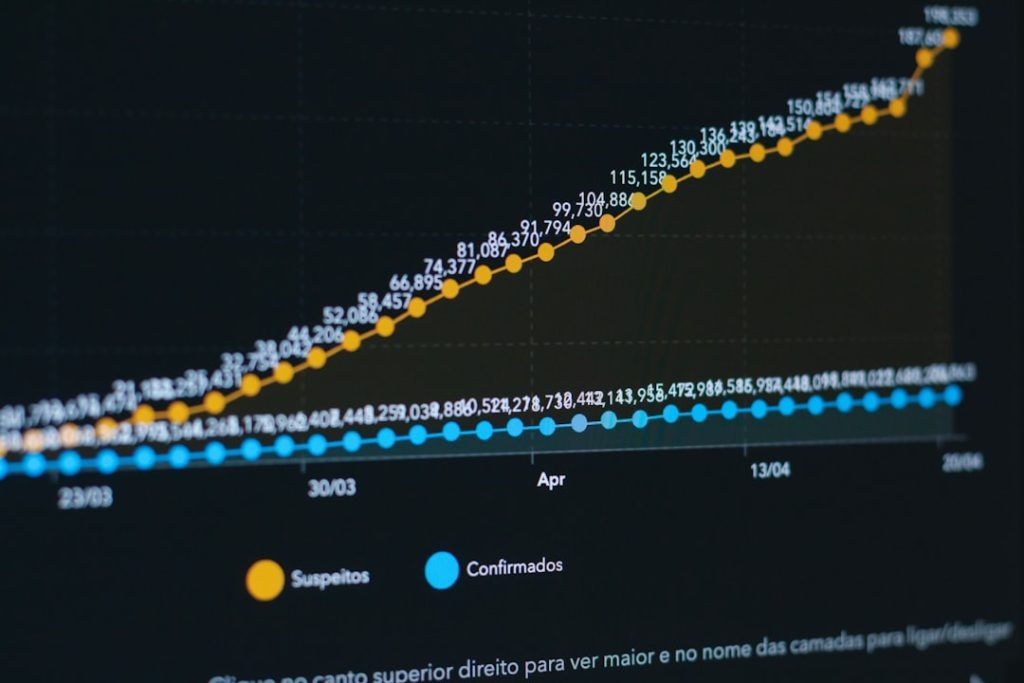
Clickstream data is a goldmine for understanding user behavior, but many small teams shy away from leveraging it due to the complexity of traditional Business Intelligence (BI) stacks. Fortunately, there’s a growing ecosystem of lightweight, compact data visualization tools designed specifically for agile teams that want to turn clickstream events into actionable insights—fast, and without needing a full-time data engineer.
TL;DR: Small teams can now analyze clickstream data without relying on bulky BI platforms. Compact tools—many of which are low-code or no-code—are redefining how events are visualized and interpreted. This article highlights eight lightweight solutions that strike the balance between power and simplicity. Whether you’re visualizing funnels, identifying user trends, or optimizing features, these tools pack a punch without the bloat.
1. Chartbrew: Open-Source & Developer-Friendly
Chartbrew is an open-source platform that connects directly to clickstream databases and APIs, allowing visual creation of charts and dashboards. It’s great for technical teams that prefer flexibility without licensing barriers.
- Best for: Technical small teams using PostgreSQL, MySQL, or MongoDB
- Key Features: REST API support, customizable charts, team collaboration
- Standout Feature: Self-hosting capability for internal privacy compliance
2. Metabase: Easy SQL-Powered Dashboards
Metabase brings the power of SQL-based visualization to non-technical users. Its visual query builder makes it easy to create complex filters from clickstream data. Teams can embed charts or share real-time dashboards via secure links.
- Best for: Startups wanting a blend of SQL power and ease of use
- Key Features: Scheduled reports, embeddable dashboards, interactive filters
- Standout Feature: Slack and email reporting automation
3. Plausible Analytics: Lightweight Web Analytics
Plausible provides simple and privacy-friendly analytics with a real-time dashboard. It auto-tracks clickstream-like events such as page views, bounce rates, and goals—without JavaScript-heavy tracking libraries.
- Best for: Teams focused on product pages or inbound marketing attribution
- Key Features: GDPR-compliant by design, no cookies needed
- Standout Feature: Ultra-lightweight script that doesn’t slow down page load
4. Lightdash: Built for dbt Fans
Lightdash converts dbt models directly into visual dashboards, enabling teams already using dbt for data modeling to skip the ETL chaos. Perfect for early-stage data stacks built around Snowflake, BigQuery, or Redshift.
- Best for: Data-driven teams using dbt pipelines and needing visualization
- Key Features: SQL-focused, dbt native, Git-integrated version control
- Standout Feature: Metric consistency by mapping directly to dbt models


5. Lightrun: Debug Clickstreams Programmatically
Lightrun isn’t a traditional charting tool—it’s a developer-native observability platform. It allows inserting logs, metrics, and traces into running applications. When clickstream tracking behaves inconsistently, Lightrun helps teams visualize backend behavior and resolve subtle issues in near-real time.
- Best for: Back-end teams needing runtime observability over clickstream issues
- Key Features: Debug live applications, add event markers programmatically
- Standout Feature: IDE-native integrations for VS Code and JetBrains
6. PostHog: Product Analytics in a Box
PostHog offers a self-hostable product analytics solution that automatically captures clickstream events like button clicks, page views, and session recordings. Its low-code event explorer and visualizations offer funnels, heatmaps, and cohorts with excellent clarity.
- Best for: Product teams analyzing feature usage and user navigation
- Key Features: Auto event capture, powerful segmentation, feature flags
- Standout Feature: Self-hosted or managed cloud options for scaling with your needs
7. Trevor.io: Self-Service SQL for Teams
Trevor.io empowers anyone on the team—not just data pros—to query and visualize clickstream data in real time. SQL templates, easy data joining, and chart exports make it ideal for democratizing insights.
- Best for: Teams without dedicated data analysts
- Key Features: Drag-and-drop builder, real-time refresh, data alerts
- Standout Feature: Query templates to simplify repetitive tasks
8. Redash: Simple yet Powerful SQL Dashboards
Redash is a classic in the compact BI space. It allows direct SQL queries and makes chart creation intuitive. With native integrations to major data warehouses, it’s ideal for lean teams who love fast visuals from a familiar SQL canvas.
- Best for: Startups with complex SQL needs but no full BI team
- Key Features: Multiple data source connections, alerts, scheduled queries
- Standout Feature: Community and open-source flexibility

Choosing the Right Tool for Clickstream Visualization
Smaller teams need to prioritize ease of integration, speed to insight, and team-wide accessibility when selecting a visualization tool. If the clickstream events are coming into a data pipeline like Snowplow or Segment, tools like Lightdash or Metabase shine. If you’re all about speed and privacy, then platforms like Plausible or PostHog could be a better fit. For infrastructure-light setups, Trevor.io and Chartbrew offer easy collaboration with minimal setup.
Frequently Asked Questions (FAQ)
- Q: What is clickstream data?
- A: Clickstream data records user interactions with a website or app, including clicks, page views, scrolls, and input fields.
- Q: Can I use these visualization tools without a data engineer?
- A: Yes. Many of these tools (like Plausible or Trevor.io) are built for non-technical users and require minimal or no coding skills.
- Q: How do these tools compare to established BI platforms like Tableau or Power BI?
- A: While tools like Tableau offer advanced features, they often come at a cost and require heavy integration. The tools listed above emphasize speed, simplicity, and affordability.
- Q: Are these visualization tools secure and compliant?
- A: Several tools such as PostHog and Plausible prioritize user privacy and compliance (e.g., GDPR). Always verify each product’s compliance level before integrating.
- Q: Can these tools scale with team growth?
- A: Many of these tools offer both free and pro tiers, allowing small teams to start lean and scale when additional users or features are needed.
Analyzing clickstreams doesn’t have to be overwhelming. With the right toolset, even lean teams can uncover powerful user journeys, optimize digital experiences, and make data-backed decisions—without a heavy BI dependency.