Every high-performing ad is a small machine built to do one thing well: move the right person from attention to action. Whether it appears on social media, search, video, email, or a landing page, a great ad combines psychology, clarity, design, and timing. The best ads rarely win because of one clever line; they convert because many small elements work together.
TLDR: A great ad converts when it instantly communicates value, builds trust, reduces friction, and gives people a clear reason to act now. For example, an online fitness brand might improve conversions by changing “Join Today” to “Start Your 7-Day Home Workout Trial,” because the second version is more specific and lower risk. In one common A/B test scenario, improving the headline, CTA, and product image can lift click-through rates by 20% to 45%, especially when the audience is already well targeted. Focus on clarity before creativity: if people do not understand the offer, they will not click.
The 15 Essential Elements of a Great Ad
-
1. A precise target audience
An ad cannot persuade everyone, and trying to do so usually weakens the message. Strong ads are built for a specific customer segment: new parents, busy founders, budget travelers, first-time homeowners, or returning buyers. The more clearly you define the audience, the easier it becomes to choose the right words, visuals, and offer.
-
2. A scroll-stopping hook
The hook is the first sentence, image, or idea that interrupts automatic scrolling. It might ask a sharp question, expose a pain point, or promise a desirable outcome. “Still spending three hours a week on manual reports?” is stronger than “Our reporting software is here.” The first version enters the customer’s world; the second talks from the brand’s point of view.
-
3. A clear value proposition
A value proposition answers the buyer’s silent question: “Why should I care?” It should explain what the product does, who it helps, and what result it creates. Avoid vague promises such as “better performance” or “next-level solutions.” Instead, say, “Create branded invoices in under two minutes” or “Cut missed appointments with automated SMS reminders.”
-
4. Benefit-focused copy
Features describe what something is; benefits explain why it matters. A noise-canceling headset has “40mm drivers,” but the benefit is “clear calls from a busy home office.” Great ads translate product details into human outcomes: save time, feel confident, earn more, reduce stress, avoid mistakes, or enjoy something sooner.
-
5. Strong visual hierarchy
People should know where to look first, second, and third. A great ad uses size, contrast, spacing, and placement to guide attention. The headline should dominate, the supporting message should be easy to scan, and the call to action should be impossible to miss without feeling aggressive.
-
6. A relevant image or video
Visuals do more than decorate; they explain the promise. A meal delivery ad should show appetizing food or a relaxed family at dinner, not a generic stock photo of vegetables. In many categories, showing the product in use works better than showing it alone, because it helps the viewer imagine ownership.
-
7. Emotional tension
People act when they feel a gap between their current situation and a better one. Great ads often highlight that tension: frustration versus ease, uncertainty versus confidence, wasted time versus control. The emotion does not need to be dramatic. Sometimes a small, familiar irritation is enough to make the offer feel valuable.
-
8. Proof that reduces doubt
Consumers are skeptical, and rightly so. Add credibility through customer reviews, ratings, case studies, certifications, press mentions, or usage numbers. A line like “Trusted by 12,000 small businesses” can make an ad feel safer, especially when paired with a believable testimonial or recognizable context.
-
9. A single conversion goal
One ad should usually ask for one action. If the viewer is asked to subscribe, download, shop, call, and learn more all at once, attention fragments. Decide whether the goal is a click, lead, purchase, demo booking, app install, or store visit, then build every element around that goal.
-
10. A compelling call to action
The call to action should be specific and active. “Get the free checklist” is clearer than “Submit.” “Book your 15-minute consultation” is more useful than “Contact us.” A good CTA tells people exactly what will happen next and makes the step feel worthwhile.

-
11. Message match with the landing page
Conversion does not end with the click. If an ad promises a 30% discount, the landing page should immediately show that same discount. If the ad promotes a beginner’s guide, the destination should not lead to a generic homepage. Strong message match reassures visitors they are in the right place.
-
12. Friction removal
Every unnecessary step lowers conversion potential. Long forms, hidden fees, slow pages, vague shipping information, and confusing layouts all create friction. Great ads often perform best when paired with a simple path: fewer fields, faster load times, visible pricing, and clear next steps.
-
13. Urgency or scarcity, used honestly
Urgency gives people a reason to act now instead of later. Examples include limited-time bonuses, seasonal offers, enrollment deadlines, or low-stock alerts. However, false urgency can damage trust. If every sale “ends tonight” but returns tomorrow, customers learn to ignore the message.
-
14. Consistent brand voice
An ad should sound like the brand behind it. A luxury skincare company may use calm, refined language, while a gaming brand may be bold and playful. Consistency builds recognition over time. Even performance ads, which are designed to sell quickly, should contribute to long-term brand memory.
-
15. Testing and measurement
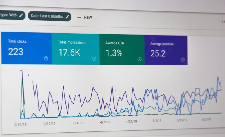
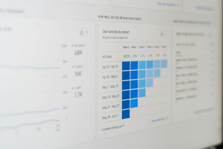
No marketer can perfectly predict what will convert. Great ads are improved through testing: headlines, images, CTAs, offers, formats, and audiences. Track metrics such as click-through rate, conversion rate, cost per acquisition, return on ad spend, and average order value. The goal is not only to find a winning ad, but to understand why it won.

How the Elements Work Together
The anatomy of a great ad is not a checklist of isolated parts; it is a system. A strong hook attracts attention, but proof keeps people engaged. A beautiful image may earn a pause, but a clear CTA earns the click. Urgency can motivate action, but only if the value proposition already feels relevant.
Consider two ads for the same online course. One says, “Improve Your Marketing Skills” with a generic laptop image and a “Learn More” button. The other says, “Build Your First Profitable Email Funnel in 14 Days”, shows a simple course dashboard, includes a student testimonial, and uses the CTA “Start the Free Lesson.” The second ad is more likely to convert because it is specific, visual, credible, and low-risk.
Final Thoughts
A great ad respects the audience’s time. It quickly answers what is being offered, why it matters, why it is trustworthy, and what to do next. Creativity still matters, but it works best when rooted in clarity. If you want better conversion rates, start by improving the fundamentals: sharpen the message, show the benefit, reduce doubt, and make the next step obvious.