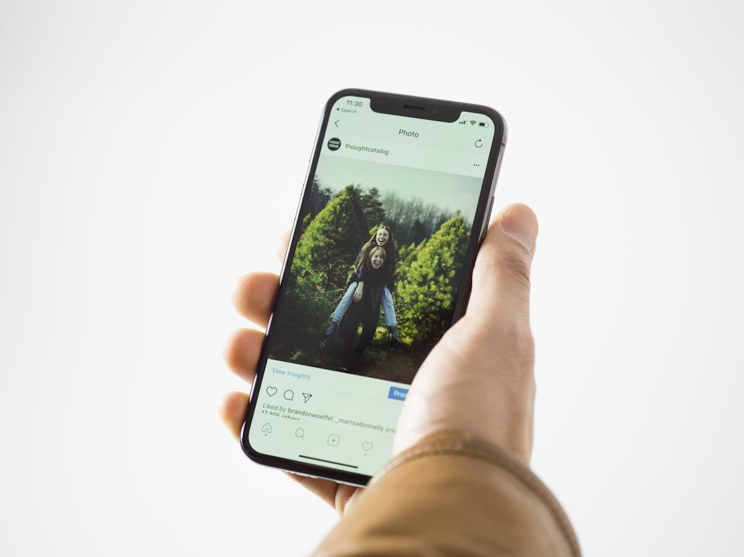
Use 1080 × 1350 pixels when you need a reliable 4:5 image for most social media feeds. That size gives you a clean vertical post, sharp detail, and fewer ugly crops on mobile screens. The 4:5 format is not a file type. It is an aspect ratio, meaning the image is 4 units wide and 5 units tall.
TLDR: A 4:5 image is taller than it is wide, and the safest standard size is 1080 × 1350 pixels. For example, a fashion store posting product photos in 4:5 can take up more vertical screen space than a square post, which often helps visibility in crowded feeds. In one simple content audit, switching from 1:1 square posts to 4:5 posts increased average feed coverage by about 25% on mobile screens. Use 4:5 for Instagram feed posts, Facebook feed ads, Pinterest-style graphics, product photos, and portrait social visuals.
What 4:5 resolution actually means
The phrase 4:5 resolution is common, but it is slightly imprecise. The correct term is 4:5 aspect ratio. Resolution describes the number of pixels in an image, such as 1080 × 1350. Aspect ratio describes the shape.
In a 4:5 image, the width is divided into 4 equal parts and the height is divided into 5 equal parts. So the image is vertical, but not extremely tall. It feels balanced on a phone screen. That is why it works so well for feed posts.
Here are common 4:5 dimensions:
- 1080 × 1350 px — best everyday choice for Instagram and general social posts.
- 1200 × 1500 px — strong option for paid social and sharper exports.
- 1600 × 2000 px — useful for higher quality source files.
- 2000 × 2500 px — good for reusable brand assets and design archives.
All of these are 4:5 because the width and height reduce to the same proportion. For example, 1080 divided by 4 is 270, and 1350 divided by 5 is also 270.

Why 4:5 works so well on social media
Most people view social media on phones. A vertical post uses more of the visible screen than a square image. That gives your photo, headline, or product more space before the user scrolls past it.
A square 1080 × 1080 post has 1,166,400 pixels. A 1080 × 1350 post has 1,458,000 pixels. That is 291,600 extra pixels, or about 25% more image area. This does not guarantee better results, but it gives your content more room to work.
For brands, that extra space matters. A product photo can show more detail. A quote graphic can breathe. A service ad can include a headline, image, logo, and call to action without feeling crammed.
The catch is that some platforms still crop previews in small places, such as profile grids, search results, or share cards. So you should design the main content safely inside the center of the image.
Recommended 4:5 dimensions by use case
1080 × 1350 px is the best default. It is large enough for high quality and small enough to upload quickly. It also matches a widely accepted feed post size for Instagram.
Use these dimensions depending on the job:
- Instagram feed post: 1080 × 1350 px.
- Facebook feed image: 1080 × 1350 px or 1200 × 1500 px.
- Paid social ad: 1200 × 1500 px, then test platform previews before publishing.
- Product photo: 1600 × 2000 px as a master file, then export to 1080 × 1350 px.
- Text-heavy graphic: 1080 × 1350 px, with wide margins and large type.
If you only want one size, choose 1080 × 1350 px. It is the least painful answer for most teams.
How to crop an existing image to 4:5
Start with a high quality image. Cropping a tiny file will not save it. If the original is blurry, the 4:5 version will still look poor.
Follow this simple process:
- Open the image in your editor of choice.
- Select crop and set the aspect ratio to 4:5.
- Place the subject near the center, unless the composition clearly needs space on one side.
- Keep faces, products, logos, and text away from the edges.
- Export at 1080 × 1350 px for posting.
Honestly, it feels like some editing tools make this harder than it should be. A simple crop can take 20 seconds longer when the app hides ratio settings behind tiny menus or resets the export size without warning. Before you upload, always check the final pixel size.
Safe areas for text, logos, and faces
A 4:5 image gives you more height, but do not use every pixel for critical content. Keep a clean margin around the edges. This protects your design from platform interface elements, preview crops, and accidental trimming.
As a practical rule, keep important content at least 80 to 120 pixels away from each edge on a 1080 × 1350 image. For text, use even more breathing room. Small text near the bottom can clash with captions, buttons, or ad labels depending on the placement.
For social visuals, the safest structure is:
- Top area: headline or visual hook.
- Middle area: product, person, or main image.
- Lower area: short supporting text, logo, or call to action.
Do not place a logo in the extreme corner unless brand rules require it. It may look tidy in your design file, then feel squeezed on a small phone.
File format, compression, and export settings
For most 4:5 social images, export as JPG if the design is photo-based. Use PNG for graphics with flat colors, sharp text, or transparent elements. For animated posts, use the format required by the platform, usually MP4 or GIF depending on the case.
Keep file size reasonable. A huge image may be compressed heavily after upload. That can create soft edges, muddy colors, and rough text. A clean 1080 × 1350 JPG at high quality is usually enough.
Recommended export settings:
- Color mode: RGB.
- JPG quality: 80% to 90%.
- PNG: use for graphics, not large photo sets.
- Text size: large enough to read on a 6-inch phone screen.
- Filename: use clear names, such as product launch 1080×1350.jpg.
Common 4:5 mistakes to avoid
The most common mistake is stretching an image to fit 4:5. Do not do that. Stretching distorts faces, products, packaging, and logos. Crop instead.
Another mistake is designing only for the full post view. Some platforms show cropped previews in grids or placements. Keep the subject centered enough that the image still makes sense if a preview trims the top and bottom.
Watch out for these issues:
- Tiny text that becomes unreadable on mobile.
- Low contrast between text and background.
- Overloaded layouts with too many messages.
- Important details at the edge of the canvas.
- Wrong exports, such as 1080 × 1349 px caused by rounding or manual resizing.

A practical workflow for teams
Create one master template at 1080 × 1350 px. Add guides for margins. Lock brand elements such as logo size, type styles, and button treatment. This reduces errors when different people prepare posts.
For each campaign, make a source design first. Then export platform-ready files. Keep the master editable. Save final posts in a separate folder. This sounds basic, but it prevents messy version names and last-minute rework.
A good 4:5 workflow should include four checks before publishing:
- Pixel size: confirm 1080 × 1350 px or another true 4:5 size.
- Mobile preview: view it at phone size, not only on a desktop monitor.
- Text clarity: read every word without zooming.
- Crop safety: make sure faces, products, and logos are not too close to the edge.
The serious answer is simple: 4:5 is one of the safest vertical formats for feed-based social media. Prepare it at 1080 × 1350 px, keep important content away from the edges, export cleanly, and always review the result on a phone before posting.