Ten short years ago, there were only 255 million websites. Fast forward to 2020, and there are over 1.3 billion, and 455,000,000 of them are using WordPress.
With this rapid development comes competition, and with that, the need to stand out. It’s why visuals now play such a crucial role in online marketing, and none more so than your logo. And with the average American seeing up to 10 thousand adverts a day, we’re looking for ways of filtering out this visual overload, so we can choose content relevant to our wants and needs.
That’s what a good logo does. It engages and connects the audience it was designed for. It’s always a quality strategic move to hire a good design company and let them do their magic. But it is a possibility to do it yourself, and in this post, we tell you how to do it. By creating a logo for your WP site in 6 simple steps.
1. Find Inspiration for Your Logo

The first steps are often the hardest. And yours are choosing a logo design that resonates with your target audience and finding the inspiration you need for creating it.
A good design company can help you navigate the challenges of creating a successful logo by providing expert guidance, creative solutions, and a keen understanding of what makes a design both visually appealing and effective in conveying your brand message.
Fortunately, there are proven strategies that make both of those a walk in the park:
- Brainstorm Ideas for Your Logo: The purpose of brainstorming is to take what’s in your head and get it out into the world. It’s not a time for self-censorship, instead, allow your creative juices to flow and write it all down, regardless of how ridiculous you think it is. As sometimes, it’s the craziest of ideas that make it into your final design.
- Think Like Your Audience Thinks: Once you’ve got your ideas down on paper, you can start adding essential design elements that are proven to attract and connect with your audience. Like colors, fonts, and shapes. But suppose you’re unsure of who your audience is. In that case, you can discover more about them by conducting a target market analysis.
- Build a Mood Board: A mood board is a visual presentation of your logo concept consisting of colors, fonts, shapes, and imagery that reflects your business’s style and personality. You use it by creating basic designs that are related to the fundamental ideas of your business. And it’s also a great way of getting other people involved, receiving feedback, and most of all, it’s a lot of fun.
2. Check out the Competition and Consider Your Target Market
Your competition and target market both require the same approach, and that’s research. Let’s take a look at why.
By researching the leading competitors in your niche and steeling (sorry, I mean borrowing) ideas for your logo, you’ll begin to notice similarities. Those will be color, logotype, fonts, and shapes, and your competitors are using them because they’re proven to work for your market.

But you could also find ways of standing out from your competitors by incorporating the essential design elements and then going in a completely different direction. For example, if they’re all serious and traditional, you could get recognized by adopting a fun styled logo and a modern design approach.
Market research is all about understanding your customers by gathering analytical data showing their needs, motivations, attitudes, and behaviors related to your business.
The more you understand your consumers, the better you’ll be able to market your business directly to them. And by understanding their needs, you can create your products and services to fulfill them, gaining you a competitive advantage over your competition.
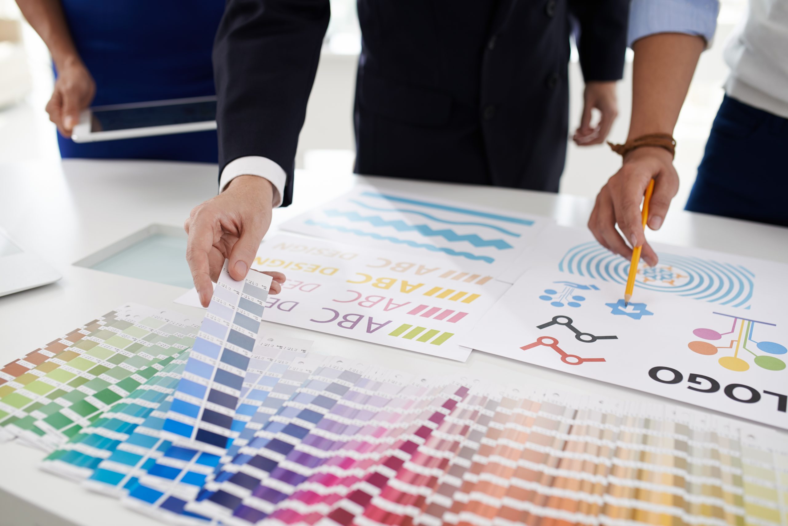
3. Choose Your Color Palette

While conducting your competitor research, you may have noticed specific colors that your competition uses repeatedly; this is due to color psychology.
Color psychology is the study of colors and the influence they have on our thoughts and behavior. And it’s one of the most crucial elements of branding and a key player when choosing your logo colors.
It doesn’t take much research to discover the color that sends the right message. However, the ones you use for your logo must also be relevant to your marketing niche and target audience.
For instance, if you’re running a gym, orange is a color that conveys vitality and fitness. On the other hand, an insurance company would opt for blue to represent honesty, security, and leadership.
Whichever colors you decide on, apply these rules:
- Brand Relevant: Your logo must match the color palette you’re using throughout your brand. Such as your website, merchandising, etc. It’s about creating a consistent connection that consumers will recognize regardless of where they see your business.
- Use as Few as Possible: The golden rule in design is simplicity. When it comes to your logo, you achieve that by using two or fewer colors. It’s why 95% of the world’s brands use only two.
4. Start Creating Prototype Logos

Now that you have a concept in mind, with the design elements chosen based upon your audience and market place, it’s time to create a logo prototype.
Professional designers advise us to start by sketching it out in black and white, creating at least six samples, and doing it quickly, so you don’t overthink it. Once you have your first ideas down on paper, you can start making minor adjustments to the position, spacing, and font thickness to create balance.
Next, you want to see how your logo will look in a digital format. And if you’re happy with your logo’s design at this stage, you can either use software like Adobe Illustrator or hire a designer to bring your logo to the digital stage.
However, if what you have on paper isn’t exactly what you had in your head, you can use a logo generator to find market and consumer-related logo ideas and see several versions of how your logo would look both digitally and on physical merchandise. It’s also an excellent way of bringing your logo to life so you get a feeling of how it will look when completed.
5. Get Feedback

It pays to get feedback before you make your final decision. Since our choices are subjective, what we might think is the perfect-looking logo might not hit the right notes with others.
You do this by having your sample logo reviewed. And while family and friends are great, they’re not the most reliable resource for feedback. Instead, you should solicit feedback from impartial 3rd parties, and you can do that by distributing an anonymous survey.
If you adopt this approach, ensure that those taking the survey are of a similar demographic to your target audience.
6. Finish by Revising Your Logo’s Design
Once you’ve received feedback, your next step is to make some revisions. If you hire a design agency or a freelance designer, they usually provide three revisions as the norm. However, if you require more, always agree upon the extra cost per revision upfront. And that’s one of the benefits of using a logo generator; they provide unlimited revisions.
Finally, check out how your logo will look when you use it on your website, and you do that by trying it on a WordPress staging site.


Comments are closed.