Brochures remain one of the most effective tools in print marketing. Despite the rise of digital alternatives, a well-designed brochure can convey professionalism, build brand identity, and grab attention in a matter of seconds. However, not every brochure achieves these goals. To ensure your brochure stands out and communicates effectively, you need to focus on its visual appeal, messaging, and structure. This article outlines the critical steps you should take when creating a visually appealing brochure that leaves a lasting impression.
1. Define the Purpose and Audience
Before diving into design, understand why you’re creating the brochure and who it is for. Are you promoting a product, announcing a service, or sharing information about an event? Knowing your target demographic helps tailor the design to their aesthetics, expectations, and needs.
- Purpose: Clarify whether the brochure is for informing, persuading, or selling.
- Audience: Consider age, profession, interests, and challenges of your readers.
These insights will inform every aspect of your design—from color selection to content layout.
2. Choose the Right Format and Fold
The structure of your brochure significantly affects how your message is perceived. Popular formats include bi-fold, tri-fold, and gate-fold brochures—each offering different creative possibilities and levels of content presentation.
- Bi-fold: Provides four panels and resembles a booklet. Ideal for formal or product-heavy designs.
- Tri-fold: Offers six panels, great for guiding a reader through a narrative or process.
- Gate-fold: Opens like a set of gates, giving visual emphasis to the central panel.
A clear format supports readability and helps guide the reader through your content seamlessly.
3. Use High-Quality Visuals and Consistent Branding
Visual elements can make or break your brochure’s professional appearance. Always use high-resolution images and graphics. Avoid vague clipart or stock photos that seem overly generic. Instead, opt for visuals that align with your brand identity, tone, and message.
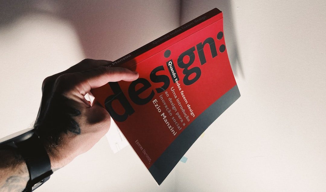
Color schemes should conform to your brand’s color palette, ensuring consistency across all marketing materials. Similarly, stick to one or two fonts—typically a headline font and a body text font—to maintain clarity and a cohesive aesthetic.
4. Create a Strong Visual Hierarchy
A good brochure naturally guides the reader’s attention from one point to the next. To achieve this, apply the principles of visual hierarchy:
- Headlines first: Use large, bold fonts to highlight section titles or key messages.
- Use subheadings: Break down sections into digestible chunks with smaller yet noticeable font sizes.
- Contrast wisely: Use contrasting colors and sizes to distinguish elements like features, calls-to-action, or testimonials.
This structure simplifies navigation and helps emphasize the most critical parts of your message.
5. Maintain a Clean Layout
An overload of content can quickly overwhelm your reader. One of the keys to a beautiful brochure is strategic white space. Allow enough breathing room around text blocks, images, and between panels. This not only improves readability but also gives the design a more elegant and refined appearance.
Additionally, align elements consistently and pay attention to margins and spacing. Irregularities can give your brochure an amateur look.
6. Highlight Your Call-to-Action (CTA)
What do you want the reader to do after reading your brochure? Whether it’s visiting your website, calling a number, or attending an event, your CTA should be prominent and persuasive.
Use color contrast, bold text, or enclosed shapes like buttons or boxes to draw attention to the CTA. Include all necessary information such as website URLs, phone numbers, or even QR codes for easy access.
7. Opt for Professional Printing
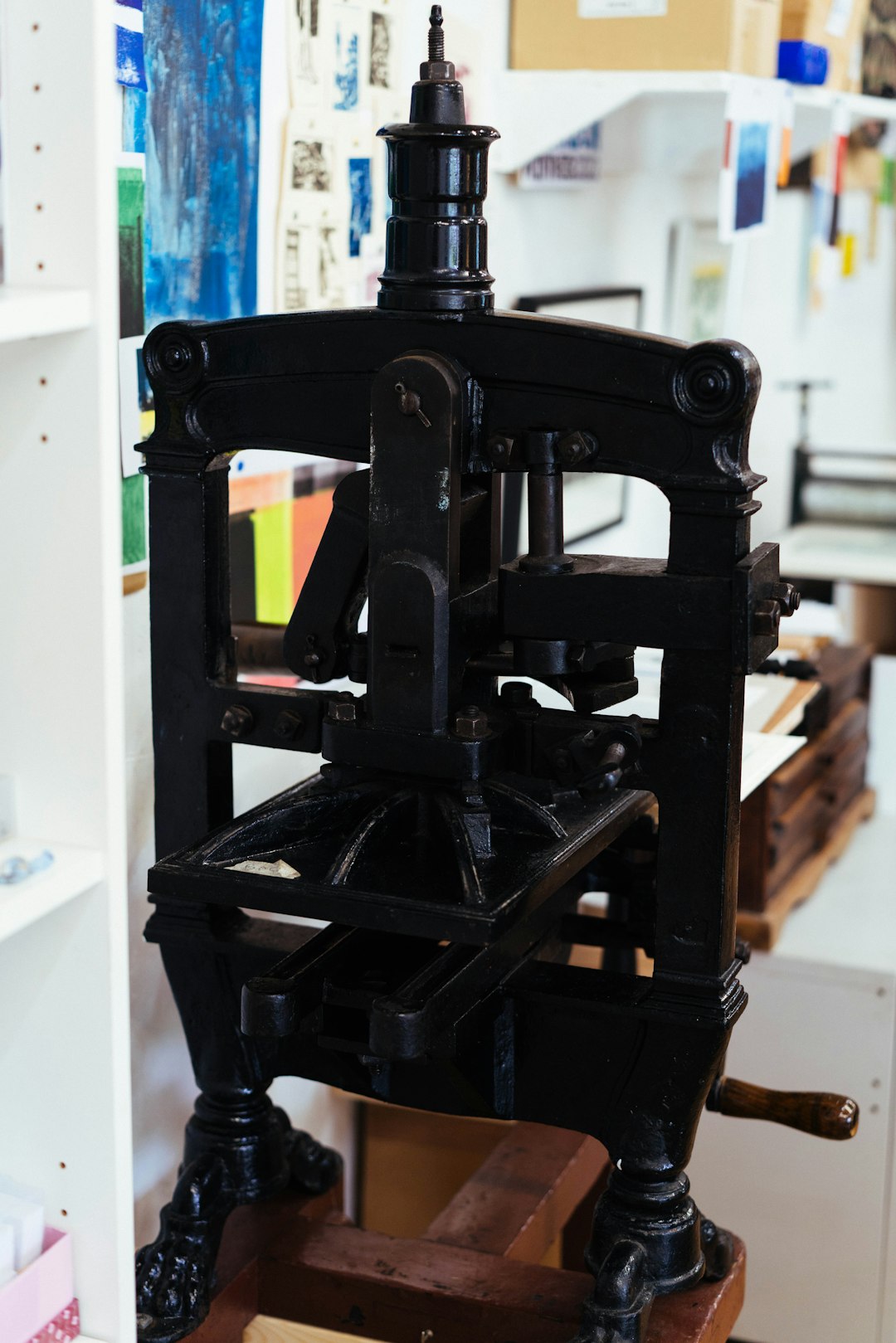
No matter how stunning the digital design may be, low-quality printing can ruin the final product. Choose a reputable printing service that offers high-resolution output, quality paper stock, and proper folding. Matte or glossy finishes can also affect how colors appear and how the brochure feels in hand, adding a tactile component to your visual efforts.
8. Proofread and Test
Before printing hundreds of copies, double-check all text for spelling, grammar, and factual correctness. Ask colleagues or clients to review both content and layout to catch errors you might have missed. If possible, print a single copy first to inspect colors, folds, and image clarity.
Finally, test the brochure’s effectiveness in the field. Gather feedback, monitor responses, and use that data to improve future versions.
Conclusion
Creating a visually appealing brochure requires a balance of aesthetic design and clear communication. By defining the purpose, choosing the right layout, utilizing high-quality visuals, and maintaining alignment with your brand, you can create a compelling piece that captures attention and drives results. Remember: a well-crafted brochure not only informs but also builds trust and solidifies your organization’s credibility.
