Imagine you’re walking down a busy street. Bright signs and logos flash everywhere. Some you recognize instantly. Others? Not so much. That instant recognition is the power of a great logo. But how do designers test if a logo is clear and unforgettable? Enter the world of logo heatmaps!
TLDR:
Logo heatmaps help designers see which parts of a logo grab attention first. They use fancy eye-tracking or simulated vision data to test recognition and readability. This saves time by showing how people really react to a logo. In short, they make logos better and more memorable!
What Is a Logo Heatmap?
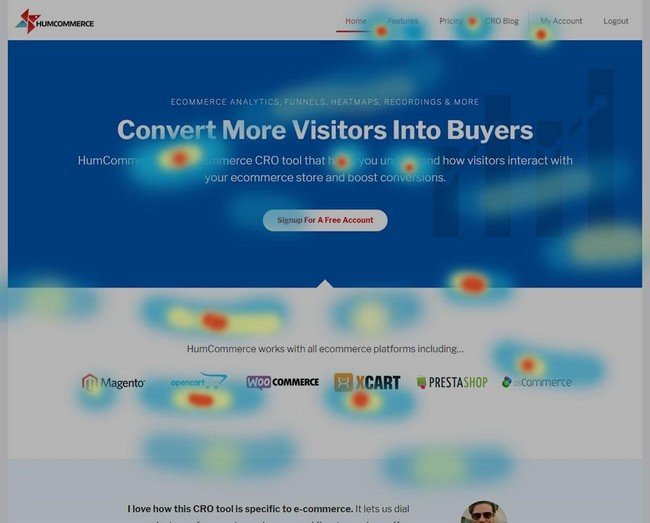
A logo heatmap is like a weather map, but instead of rain and clouds, it shows where people look when they see your logo. The “hot” areas are where the viewer’s eyes go first. The “cool” areas? Those get ignored.
Designers use heatmaps to fix weak spots in logos. If people miss your brand name or icon, that’s a problem. Heatmaps show that clearly and visually.
Why Should You Care?
Logos are like your company’s face. If people don’t recognize your face, how can they trust you?
Here’s why testing logos with heatmaps is super important:
- First impressions count: People decide in milliseconds if your logo is good.
- Instant recognition: You want people to connect the icon with your brand right away.
- Readability matters: If the text isn’t clear, people won’t remember your name.
How Do Logo Heatmaps Work?
There are two main ways to create a heatmap:
- Eye-tracking – This uses real people. A camera records where they look when they see your logo. It’s accurate but expensive.
- A.I. simulation – This uses computers to predict where eyes will look. It’s fast and affordable.
The result is almost the same: a colorful map showing what grabs attention and what gets ignored.

What Makes a Good Logo According to Heatmaps?
When you look at heatmap results from top logos, some common traits pop up:
- Simple shapes: Your brain loves easy patterns. Heatmaps show more focus on logos with fewer elements.
- Bold fonts: Thin text gets ignored. Chunky letters get noticed.
- Strong contrast: A dark logo on a light background (or vice versa) wins attention.
- Left-to-right flow: People’s eyes move the way they read. Logos designed with that movement in mind score higher.
Testing Recognition: Do They Know Your Logo?
Recognition is the golden ticket. A logo has to be burned into people’s brains.
To test this with a heatmap:
- Show your logo quickly — maybe just 1 or 2 seconds.
- Use eye-tracking to see where people look.
- Check if they remember it later. Ask questions like “Which logo did you see?” or “What did it say?”
If people focus on your icon and name within that time, congrats — your logo rocks!
Testing Readability: Can They Read It?
You spent hours picking the perfect font, but can anyone actually read it? Heatmaps can help. They show if people stare at the text or skip over it like junk mail.
Here’s what to look for:
- Too many swirls? Fancy fonts may look pretty, but they often confuse the eyes.
- Font color blends in? If your text is the same color as the background, it vanishes.
- Spacing is off? Letters jammed close together make words hard to scan.
Heatmap testing reveals all these issues fast, before your logo ends up on billboards and backpacks.
Real Life Example
Let’s say a bakery called “Sweet Whiskers” creates a cute logo — a cat holding a cupcake. But people keep referring to it as “Sugar Cat.” Uh-oh.
Using a heatmap, the team finds out people only focus on the cat, not the name. The solution? Move the name up, make it bigger, and increase the contrast. Now people see both the cat and the name — problem solved!

Tips for Better Logo Design, Backed by Heatmaps
Not every logo needs a test flight, but smart designers test often. Here are some quick tips that heatmap tests say work:
- Keep it simple: Too many details confuse the eye.
- Avoid tiny text: No one squints on purpose.
- Use contrast: Make your design pop.
- Design for speed: Aim to catch attention in less than a second.
- Test different versions: Use A/B tests to find a winner.
How Can You Try Logo Heatmaps?
Good news! You don’t need a giant budget. Many platforms offer AI-based testing at low cost or even free trials. Here are some tools to get started:
- Attention Insight – Predicts what people will look at.
- EyeQuant – Simulates eye-tracking for fast results.
- Hotjar + Landing Pages – Not just logos, but where users look on your site banners.
Upload your logo, get your heatmap, and use the results to tweak your design.
Final Thoughts
A logo is more than art. It’s your brand’s handshake. A bad logo gets ignored. A good one gets remembered.
With logo heatmaps, you can stop guessing what works and actually see what does. It’s like turning on the lights in the design process.
So test early. Test often. And let your logo shine!


