
Adding and aligning images in the WordPress Block Editor (Gutenberg) is essential for creating visually appealing content. Proper image placement enhances readability, improves user experience, and plays a crucial role in SEO and page performance. However, many users struggle with image alignment, positioning issues, and responsiveness across different devices.
This guide provides a step-by-step explanation of how to insert and align images in the WordPress Block Editor, ensuring they display correctly on all screen sizes.
Understanding Image Blocks in WordPress Block Editor
WordPress uses blocks to format content, and images are added using the Image Block. Unlike the Classic Editor, where images were manually positioned, the Block Editor offers built-in alignment options to make customization easier.
With the Image Block, you can:
- Upload new images or use existing ones from the Media Library.
- Align images left, right, center, wide width, or full width.
- Add alt text for SEO and accessibility.
- Resize, crop, or add captions directly within the editor.
Understanding how these options work helps you structure content effectively.
How to Add Images in WordPress Block Editor
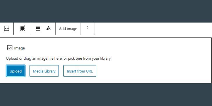
Adding an image in WordPress is straightforward. Follow these steps:
- Open a post or page where you want to insert an image.
- Click the “+” (Add Block) button and select Image Block.
- Choose one of the following options:
- Upload – Add a new image from your computer.
- Media Library – Select an image already uploaded to WordPress.
- Insert from URL – Use an external image link.
- Once inserted, you can resize the image, add captions, or change its alignment.
For best results, use optimized images to prevent slow loading times. JPEG and PNG are the most common formats, while WebP provides better compression and quality.
Aligning Images in WordPress Block Editor
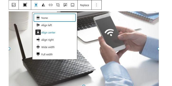
After adding an image, you can adjust its alignment to fit your content layout.
Basic Image Alignment Options
WordPress provides several built-in alignment choices:
- Align Left – Places the image on the left with text wrapped around it.
- Align Right – Positions the image on the right with text wrapping around it.
- Align Center – Centers the image with no text wrapping.
- Wide Width – Extends the image beyond the content width but not full-screen.
- Full Width – Stretches the image to cover the entire content width.
To align an image:
- Click on the image.
- Select the alignment option from the toolbar above it.
- Adjust the layout as needed.
If the alignment does not work as expected, theme limitations or CSS styling might be affecting the layout.
Using Other Blocks for Better Image Placement
For more advanced layouts, consider using other blocks designed for images.
Media & Text Block (For Text-Wrapped Images)
The Media & Text Block is ideal for displaying images beside text without alignment issues. It ensures a balanced layout while keeping the image and text aligned properly.
To use it:
- Click Add Block (“+”) and select Media & Text.
- Upload or select an image.
- Enter text in the provided field next to the image.
- Adjust the alignment and layout settings as needed.
Gallery Block (For Multiple Images)
If you need to add multiple images in a grid format, use the Gallery Block instead of inserting separate image blocks.
Cover Block (For Background Images)
The Cover Block is useful for hero images or background banners with text overlays.
These blocks provide more design flexibility than the standard Image Block.
Responsive Image Alignment for Mobile & Tablets
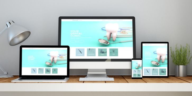
Ensuring images resize correctly on all devices is crucial for a seamless user experience.
How to Make Images Mobile-Friendly:
- Use percentage-based widths instead of fixed pixel dimensions.
- Ensure images are optimized for different screen sizes.
- Preview your post using WordPress’s responsive mode to check how images appear on desktop, tablet, and mobile views.
If images don’t align properly on mobile, custom CSS may be needed to fix spacing and alignment issues.
Image SEO Best Practices in WordPress Block Editor
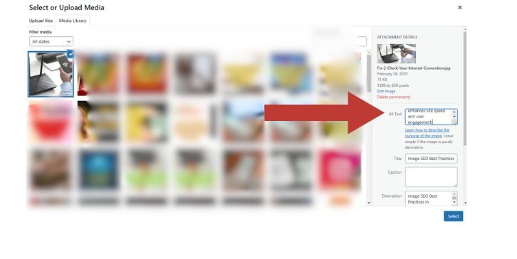
Optimizing images improves both search rankings and page speed. Follow these best practices:
- Add Alt Text – Describe images to improve accessibility and SEO.
- Use Compressed Images – Reduce file sizes using tools like TinyPNG or Imagify.
- Enable Lazy Loading – Delays image loading until users scroll, improving performance.
- Use WebP Format – Provides better compression than JPEG or PNG.
Applying these optimizations enhances site speed and user engagement.
Troubleshooting Image Alignment Issues in WordPress
Sometimes, images do not align properly due to theme or plugin conflicts.
Common Problems & Fixes:
- Alignment Not Working? Your theme might override the Block Editor’s alignment settings. Try adding CSS fixes.
- Images Not Resizing on Mobile? Check if your theme uses fixed image dimensions and adjust them.
- Text Not Wrapping Around Images? Use the Media & Text Block instead of the Image Block for better control.
If alignment issues persist, switching to a more flexible theme or using a page builder like Elementor may help.
When to Use Plugins for Advanced Image Customization
While WordPress’s default options are sufficient for most users, plugins can enhance image placement and alignment.
Best WordPress Plugins for Image Alignment & Optimization:
- Smush – Compresses and optimizes images for faster loading.
- Enable Media Replace – Replaces images without breaking links.
- WP Rocket – Adds lazy loading for better performance.
Plugins help automate optimizations and provide advanced image customization options.
Conclusion
Adding and aligning images in the WordPress Block Editor is easy when you understand the Image Block settings, alignment options, and responsive design techniques.
For simple layouts, use the default Image Block, and for more structured designs, leverage Media & Text, Gallery, or Cover Blocks. If alignment issues arise, checking theme settings, optimizing images for mobile, and troubleshooting conflicts will ensure a smooth experience.
By following these steps, you can create well-structured, visually engaging content that looks great on all devices while maintaining fast loading times and strong SEO performance.


