A 1 pager is a single-page document that explains one offer, idea, product, service, campaign, or business case with enough clarity to support a decision. It is not a brochure stuffed into one sheet. It is a focused argument, built for people who do not have time to hunt for the point.
TLDR: A strong 1 pager states the audience, problem, offer, proof, and next step on one clean page. For example, a B2B software team might use one before a sales call to show that its tool cuts invoice processing time by 37% across 120 customer accounts. If the reader can understand the value in under 60 seconds, the document is doing its job. If they need a meeting just to decode it, the 1 pager has failed.
What Is a 1 Pager?
A 1 pager, sometimes called a one-page brief, sales sheet, or one-page marketing document, is a concise document designed to communicate one message fast. It may describe a product, summarize a service, pitch an internal initiative, support a funding request, or introduce a campaign.
The format is simple, but the work behind it is not. A good 1 pager forces choices. You cannot include every detail, every feature, every chart, and every quote. You have to decide what matters most to the reader.
That discipline is the value. A 1 pager turns a scattered message into a practical asset that a sales rep can send, an executive can scan, or a buyer can share with a team.
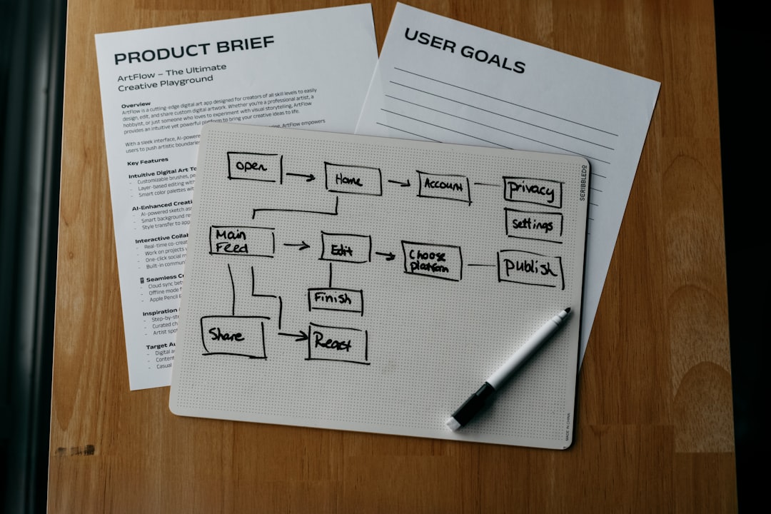
When to Use a 1 Pager
Use a 1 pager when the reader needs a clear summary before taking the next step. It works best when attention is limited and the decision is not yet final.
- Sales outreach: Send it after a first call or as a pre-call primer.
- Product marketing: Explain a new feature, package, or use case.
- Events and trade shows: Give prospects something useful to take away.
- Investor or partner updates: Present key metrics and the business case.
- Internal approvals: Summarize a proposal for managers or budget owners.
- Customer onboarding: Explain what happens next and what success looks like.
The catch is that 1 pagers are often used as a dumping ground. Teams throw in mission statements, product screenshots, testimonials, pricing notes, and legal language. Then nobody reads it. A one-page document still needs editing, hierarchy, and restraint.
What a 1 Pager Should Achieve
A serious 1 pager should do three things:
- Clarify the issue: Show the reader that you understand the problem or opportunity.
- Present the answer: Explain the offer in plain terms.
- Prompt action: Tell the reader what to do next.
That action might be booking a demo, approving a pilot, replying to an email, scanning a QR code, or sharing the page with a colleague. Without a next step, the document becomes informational clutter.
How to Structure a 1 Pager
Most effective 1 pagers follow a practical structure. You can adjust the order, but each section should earn its space.
1. Header With a Clear Promise
The header should explain the main value in one sentence. Avoid vague claims like “Smarter Solutions for Growth.” Say what the reader gets.
Weak: “Transform Your Operations”
Stronger: “Reduce Manual Invoice Review Time by 30% in 90 Days”
2. Audience and Problem
State who the document is for and what pain it addresses. This creates relevance fast.
For example: “Built for finance teams processing more than 5,000 invoices per month.” That is specific. It helps the wrong reader self-select out and the right reader keep reading.
3. Offer or Solution
Explain what you provide. Keep it plain. Avoid jargon unless your audience uses that language every day.
Use short bullets to show what the product or service includes:
- Automated invoice capture
- Exception flagging
- Approval routing
- ERP integration
- Monthly performance reporting
4. Proof
Trust needs evidence. Use numbers, customer quotes, certifications, case results, or process details.
Good proof may include:
- Metrics: “Average approval time fell from 6.4 days to 3.1 days.”
- Customer data: “Used by 240 mid-market finance teams.”
- Third-party signals: Compliance standards, audits, awards, or analyst mentions.
- Case study snapshot: Before, after, and time frame.
5. Visual Hierarchy
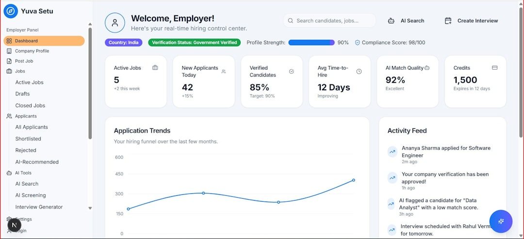
A 1 pager is read with the eyes before it is read word by word. The layout should guide the reader from headline to proof to action.
Use:
- One dominant headline
- Two or three short content blocks
- Limited color accents
- Simple icons only when they clarify meaning
- Enough white space to reduce strain
Honestly, it feels like many design tools make this harder than it should be. Moving one text box by a few pixels can take 20 seconds longer than expected because alignment controls are buried or inconsistent. That frustration leads people to accept a messy layout. Do not. A crowded page damages trust.
6. Call to Action
End with one clear action. Not five. If the next step is a demo, say so. If the next step is downloading a technical guide, say that.
Strong calls to action include:
- “Book a 20-minute assessment.”
- “Request the implementation checklist.”
- “Scan to compare plan options.”
- “Email procurement for pilot pricing.”
How to Make One-Page Marketing Documents Effective
Start with the reader, not the company. Many 1 pagers open with company history. That usually wastes prime space. The reader wants to know whether the document is relevant, credible, and worth acting on.
Use plain numbers where possible. “Faster reporting” is weak. “Close monthly reporting 2 days sooner” is stronger. Specific claims feel more serious because they can be judged.
Keep paragraphs short. A 1 pager is not the place for dense blocks of text. Use bullets, labels, and section headers. Each part should answer a question the reader already has.
Match the detail level to the use case. A sales 1 pager may emphasize pain points, benefits, and results. An internal proposal may need cost, risk, timeline, and owner names. A product sheet may need specs, integrations, and package limits.
Also, keep the file practical. Use a readable PDF. Make sure links work. Compress images. Check how it looks on a laptop and phone. Expect to waste time on tiny formatting issues if you build it in software that was not made for layout work, so leave time for review.

Common Mistakes to Avoid
- Trying to say everything: A 1 pager should create interest, not replace every sales conversation.
- Using generic claims: Words like “innovative” or “best-in-class” need proof or removal.
- Ignoring the audience: CFOs, users, buyers, and partners care about different things.
- Hiding the next step: The call to action should be easy to find.
- Overdesigning the page: Decoration should never compete with the message.
A Simple 1 Pager Template
Use this structure when you need a reliable starting point:
- Headline: One sentence that states the value.
- Audience: Who this is for.
- Problem: The pain, risk, or missed opportunity.
- Solution: What you offer.
- Key benefits: Three to five bullet points.
- Proof: Numbers, results, quotes, or credentials.
- Process: What happens after the reader responds.
- Call to action: One clear next step with contact details.
A strong 1 pager respects the reader’s time. It strips away noise and presents a focused case. If it can explain the value, prove credibility, and trigger the right next step on a single page, it has done its job.