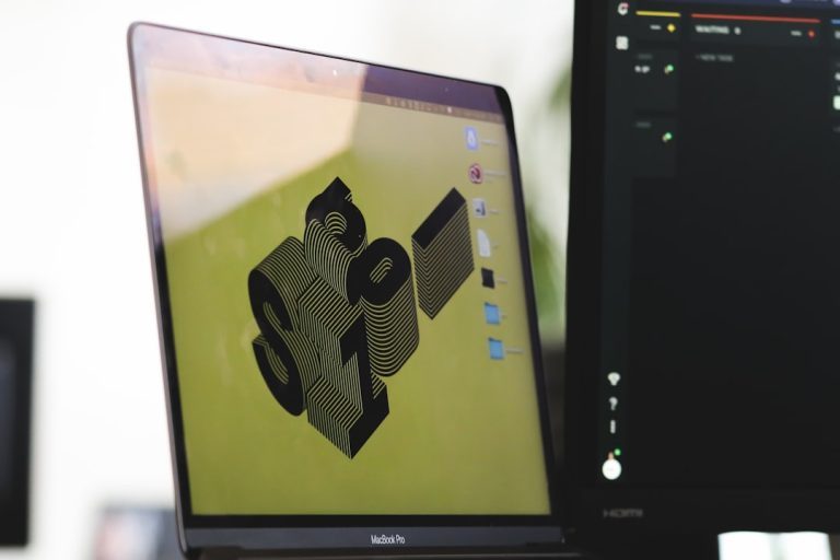
Web design has come a long way, especially in terms of styling. One of the key variations that will catch your attention is in website background. Today, backgrounds are one of the core features that determine how visually interesting a website is.
What kind of background variant should one use for their website? You can have the basic content and the layout of your website pretty much nailed down, but the background is either too boring or too busy that it distracts the entire website design.
Web designers try to impress visitors with cutting-edge visual elements. Background patterns are among those visual elements that when designed properly, can create an amazing atmosphere and convey the style the designer has chosen.
Enticing backgrounds help images achieve their goals in engaging and facilitating the design elements and content.
You have decided on a jaw-dropping background image for your website landing page. But how and what do you use that fits your business? There are several factors to consider when choosing the right background for your website. You need to learn what to look for, where to find it, and how to optimize the background.
What to Look For When Choosing Background for Website
Choosing the perfect background image starts off with knowing what to look for. You have the liberty to choose any background image, but a carefully selected image is proven to give you far greater results. You will need to make a few considerations to ensure you are selecting the best background possible. Here are some of the best practices for selecting the perfect background for your website.
- Background that Draws the Eye
You only have a few seconds to grasp the attention of the visitor to your website. Your background is there to incite initial interest and help convert the viewer to sales. An eye-catching background compels visitors to stay on the page and can be used to direct them to help convert them into sales.

- Background That Contrasts With Text
Website copy should be easy to read against background image—sometimes image backgrounds can clash with font colors and make it difficult to read what’s on the page. For example, the following background image would work great if it had a shaded box surrounding the text or darkened background patterns to increase the readability of the copy.

- Background That Compliments Layout
Layout plays a very important role in increasing conversion rates. With careful placement, your background will catch the attention to specific aspects of your copy. Choose a background that compliments your layout and emphasizes the CTA.
- Background That Conveys a Message
Avoid implementing backgrounds with images that draw more attention than the primary objective of the page. Use a background image that compliments or even help explain your business without interfering from the main agenda the website is selling.
Typical Background Ideas for Your Next Project
Let’s take a look at some background ideas to grab some inspiration on how to effectively add interesting backgrounds to a web page.
- Sketch
Sketch background has long been popular and still persists today. It comes from the idea of a notebook filled with squiggles, like that of a typical teenager’s work in class. It features a rough quickly sketched appearance and the page looks it’s presenting a random collection of ideas, all scattered around and placed at various rotations.

- Subtle Parchment
Paper textures intrigues. The trend to use now is not so much of the intense effect of yesterdays, but instead a much more noble effect. Take a look at Beautiful Type’s site below to see how the texture used isn’t distracting nor exaggerated but instead merely brings a nice finish to a page.

- Radial Gradient
Gradients reflect reality; so are used to make the website look and feel more real. It is best to keep things simple with gradients, as they can be easily misused and poorly executed. Avoiding mixing crazy colors and creating muddy transitions, instead opt for a simple gradient. A good illustration of the good use of gradient is the gray to black radial gradient shown below on the 177themes website.

- Tone It
Putting a hard transition right through the page is particularly elegant or bold, depending on the execution. Typically, it is done horizontally but can also be done vertically; in fact, this way it feels unique and eye-catching. The trick here is to utilize the magic of contrast—since our eyes are indeed attracted to contrast, we find ourselves looking. Make use of two colors that contrast but avoid anything that conflicts or clashes.

Background Best Practices
Backgrounds are one of the core features that determine how visually interesting a website is. It holds the theme of a website. Designing a website background presents a vast amount of possibilities. Let’s take a look at the best practices and popular trends of backgrounds in innovative web design.
Basic Background Features
First, let us look at basic background set ups. The following three are the most often used, though not the only structures out there.
- Body Background
This is the most distant background. It is usually an image, texture/pattern, illustration or another graphical element.
- Content Background
This is the background of the patterns consisting of images, text, and other base data or information.
Laying Content Directly on Body Illustration
Lay content directly on a background, done with body backgrounds made of illustrations, images, and textures. It will work nicely if you get the color balance perfect but can be trickier with images. This is a contrast between the background and content that makes the content to be easily readable and scannable.
Layered Content and Body Background
Consists of a large image and containers of content layered on top of the background, with the core content having a solid background, but the titles have a semi-transparent background.
One Body and Content Background
This is the most simple and basic structure of background. The content background is the body background. It is achieved with a single color or a few different colors, but nothing too complex.
How to Work With Backgrounds on Headers/Wrappers
The header and wrapper are among many places to implement a good background design. Here are few ideas on how to work with backgrounds in those two areas.
Standard Header Background
Standard header background patterns for websites to use include illustrations, textures, images, and colors. This is an easy way to liven up the website without interrupting the core content in the wrapper.
Use a good transition when designing a header that is separate from the rest of the layout.
You can use free vector background patterns to add a little more personality and feeling to a website. It also helps to make the design more memorable and plays into the overall theme of the website. You can use illustrations in the background of the wrapper in a standard layout, then allow them to flow over, to create an excellent and beautiful technique.
Match the transition from the wrapper graphic to the plain background—match the color on the very edge of the graphic to the color of the website’s body background.
Consistency is one of the most important characteristics in web design. Make the illustration for the wrapper carry the same style as the rest of the website, with the color palette being similar too.
For a smoother layout with an illustrated wrapper, allow some graphic to bleed into the content area. Allow some of the illustration to flow over and into the content container.
Full Body Backgrounds
Full body backgrounds can be trickier as they can easily throw off the rest of the design if not done correctly. Use the following ideas to work around any problems you may experience with full body backgrounds.
- Avoid Taking Away From The Content
Though you have so many opportunities when designing a background, beware of the fine line between a beautiful background and one that detracts too much from the content. Pay attention to contrast and the number of background patterns for websites.
A too busy body background won’t look so good. A too bright background color will grab the user’s attention before the core content does.
Free Vector Abstract Background You Can Use
There are some colorful free vector background patterns you can use which are both great for design inspiration, and sweet to use on your desktop. Free vector abstract background with concentric circles, twinkling stars, rainbow colors, dots, cloud-a-like shapes, and arrows. The use of these vector backgrounds and vector elements in backgrounds in web design became a trend among web developers.
It can be frustrating when working out a web design that isn’t just coming together. You don’t have the time to sort something from scratch so you decide to search for some free vector backgrounds online. Free vector backgrounds can be a lifesaver for any designer. But the process of finding what you need amidst cluttered, confusing pages just adds to the mounting deadline stress. To help you avoid that experience, you need to make use of some free vector art resources, which include Vector4Free, Freepik, FlatIcon, Fudgegraphics, etc.


Comments are closed.