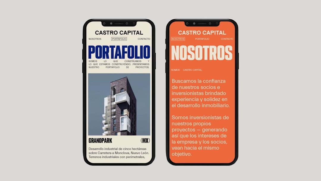
A strong newsletter front page works like a storefront window: it tells readers what is inside, why it matters, and where to go next. Whether your newsletter is a weekly company update, an editorial digest, a nonprofit bulletin, or an ecommerce promotion, the first screen must quickly organize attention. Good design is not only about looking polished; it is about helping readers decide what to read, click, save, or share.
TLDR: The best front page newsletter designs use a clear hierarchy, a compelling lead story, concise content sections, and obvious calls to action. For example, a local fitness studio could place a “January Challenge” announcement at the top, followed by class highlights, trainer tips, and a signup button. If analytics show that 62% of readers click within the first 20 seconds, the most important link should appear near the top, not buried at the bottom. Keep the layout simple, scannable, and consistent from issue to issue.
Start with a Clear Visual Hierarchy
The front page should answer three questions immediately: What is this newsletter about? What is the most important item? and What should I do next? Visual hierarchy makes those answers obvious by using size, spacing, contrast, and placement.
Your newsletter header should include the brand name or publication title, a short tagline if useful, and the issue date. Keep this area clean. A crowded header with too many links, icons, or promotional badges can reduce the impact of the main message. Below the header, feature one primary story, offer, announcement, or editorial note. This is the “hero” section and should have the strongest headline on the page.
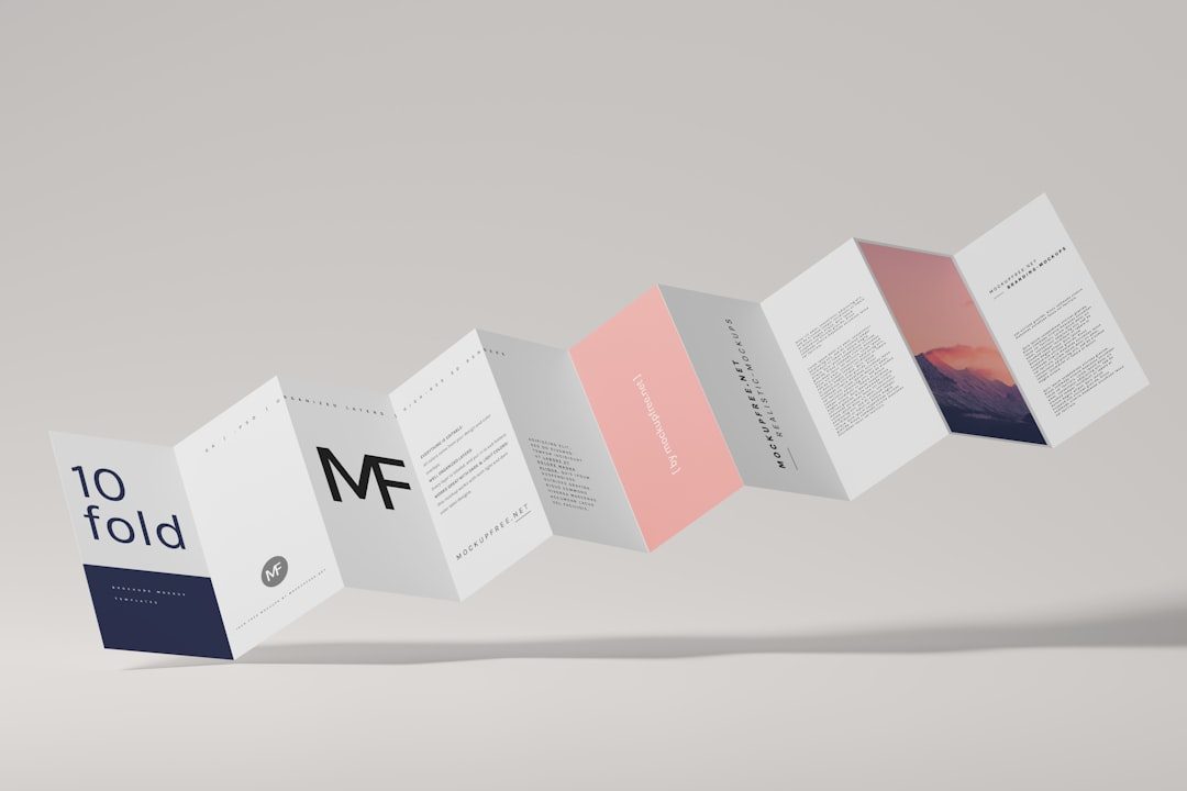
A practical hierarchy might look like this:
- Header: Newsletter name, logo, date, and optional navigation.
- Hero section: Main story, campaign, or announcement.
- Secondary content: Supporting articles, updates, products, or events.
- Quick links: Short items that invite fast scanning.
- Footer: Contact information, preferences, and compliance links.
Choose a Layout That Matches the Content
There is no single perfect newsletter layout. The right structure depends on the amount of content, the audience’s habits, and the main goal of the issue. However, a few layout patterns work especially well for front pages.
1. The Editorial Digest Layout
This format is ideal for publishers, blogs, professional associations, and internal communications. It opens with a featured article, then presents smaller stories in a neat list or grid. Each item should include a short headline, a one-sentence summary, and a link. The goal is to help readers browse quickly without feeling overwhelmed.
2. The Promotional Layout
For ecommerce, events, courses, and product launches, the front page should focus on one main offer. Use a strong headline, a clear benefit, a product image or campaign visual, and a prominent button. Secondary sections can include testimonials, related products, deadlines, or frequently asked questions.
3. The Community Update Layout
This layout works well for nonprofits, schools, clubs, and local organizations. It often includes a welcome note, announcements, event dates, member spotlights, and calls for participation. Warmth and clarity matter more than flashy design. Readers should feel informed and included.
Build Content Sections Readers Can Scan
Most readers do not read newsletters from top to bottom. They scan. That means your content sections should be short, clearly labeled, and visually distinct. Use headings and brief summaries to create entry points throughout the page.
Consider adding sections such as:
- Editor’s Note: A short personal introduction that frames the issue.
- Top Story: The most important article, announcement, or offer.
- What’s New: Product updates, team news, policy changes, or recent releases.
- Upcoming Events: Dates, deadlines, webinars, launches, or community activities.
- Tips or Resources: Practical advice, guides, checklists, or recommended reading.
- Featured Person or Customer: A profile, quote, testimonial, or mini case study.
- Quick Links: A compact list of useful links for readers who are in a hurry.
The trick is restraint. A newsletter front page should not feel like a storage room for everything the organization wants to say. If a section does not support the issue’s main purpose, move it to a later page, a separate email, or a website landing page.
Use Images with Purpose
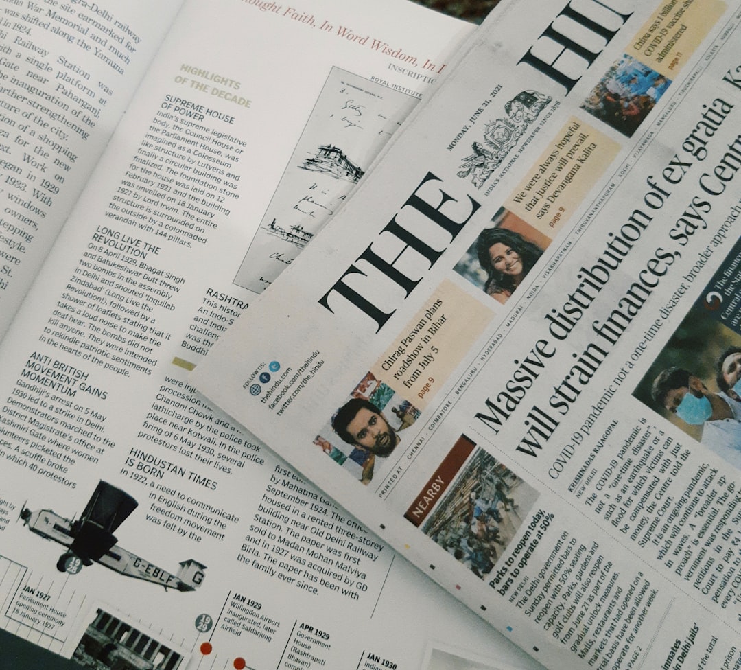
Images can make a newsletter feel lively, but they should not be decorative filler. A good image explains, supports, or emotionally reinforces the message. For example, a behind-the-scenes photo can make a company update feel more human, while a product image can quickly show what is being offered.
Keep image sizes optimized so the newsletter loads quickly. Add descriptive alt text for accessibility, and avoid placing essential information only inside an image. If the image fails to load, readers should still understand the message from the text.
Make Calls to Action Obvious
Every newsletter front page needs at least one clear call to action, often called a CTA. This could be Read the full article, Register now, Shop the collection, Download the guide, or Share your feedback. The CTA should match the reader’s likely intent and the publisher’s goal.
Use button-style links for primary actions and text links for secondary ones. Avoid placing several equally strong buttons next to each other, since that can create decision fatigue. If everything is urgent, nothing feels urgent.
A useful approach is to assign each section one job. The hero section drives the main click. The resource section encourages learning. The event section encourages registration. This keeps the front page organized and measurable.
Design for Mobile First
Many readers will open newsletters on a phone, so mobile design is not optional. A beautiful desktop layout can fail if the text becomes tiny, columns stack awkwardly, or buttons are difficult to tap. Use a single-column layout whenever possible, especially for text-heavy newsletters.
For mobile-friendly front pages:
- Keep headlines short and specific.
- Use generous spacing between sections.
- Make buttons large enough to tap comfortably.
- Avoid dense multi-column layouts.
- Place the main message high on the page.
- Test the newsletter in both light and dark modes when possible.
Balance Branding with Readability
Brand consistency builds recognition, but readability keeps people engaged. Use brand colors, fonts, and imagery with discipline. A newsletter front page should feel familiar each time it arrives, yet flexible enough to highlight different stories or campaigns.
Limit your color palette to a few core colors. Use high contrast between text and background, especially for body copy. Decorative fonts can work in headers, but long paragraphs need simple, readable typography. If your brand style is bold or playful, let that personality appear in accents, illustrations, section labels, or microcopy rather than overwhelming every inch of the page.
Measure What Works
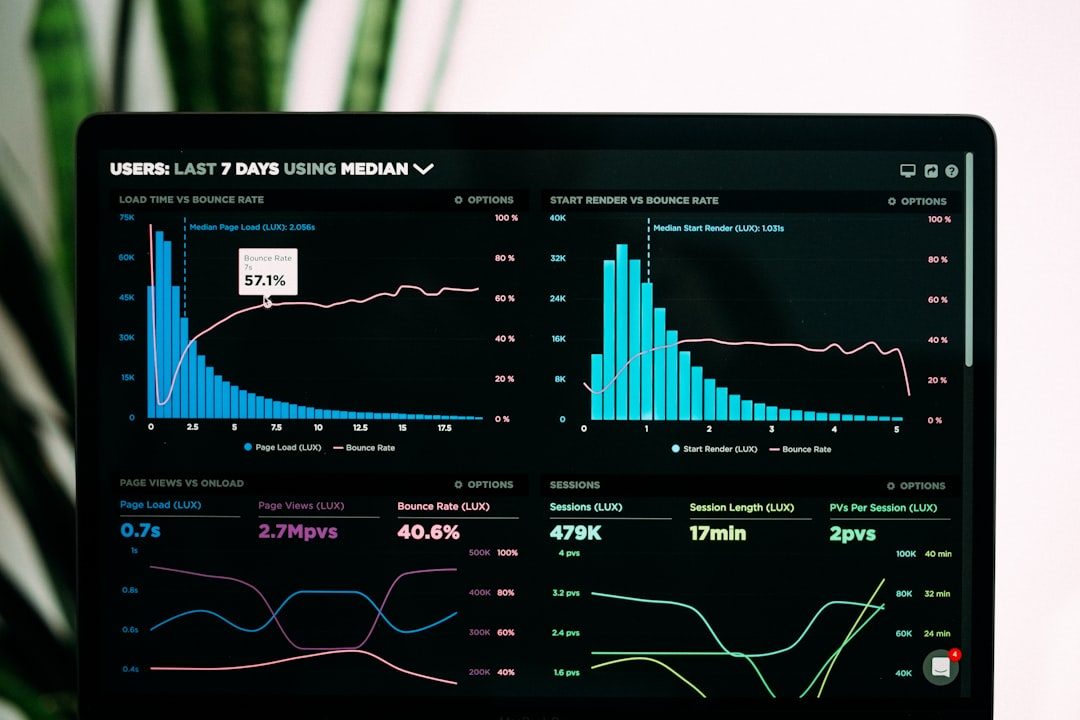
Design decisions become stronger when supported by data. Track open rates, click-through rates, scroll depth, link clicks, and unsubscribes. If readers consistently click the second story more than the hero story, your assumptions about priority may need adjustment. If a long newsletter receives low engagement below the halfway point, consider shortening the front page or moving secondary content into a linked archive.
Testing can be simple. Try two subject lines, two hero headlines, or two CTA button labels. You do not need to redesign the entire newsletter every week. Small tests, repeated consistently, reveal what your audience values.
Best Practices for a Strong Front Page
- Lead with value: Show readers what they gain by continuing.
- Keep sections predictable: Familiar structure makes each issue easier to navigate.
- Write concise headlines: Clarity beats cleverness when attention is limited.
- Use white space: Empty space helps important content stand out.
- Prioritize accessibility: Use readable font sizes, meaningful link text, and alt text.
- Limit competing messages: One main goal should guide the page.
A well-designed newsletter front page is part strategy, part storytelling, and part user experience. It should welcome readers, organize information, and make the next step feel natural. When layout, content sections, and best practices work together, your newsletter becomes more than an update—it becomes a reliable touchpoint that readers look forward to opening.