Grids are the secret dance floor of design. You may not see them at first. But they guide every image, button, headline, and tiny bit of space. A good grid helps a layout feel calm, clear, and easy to use. A special grid can make it feel alive.
TLDR: Special grid systems help designers organize content in smarter ways than simple rows and columns. For example, an online store that changed from a basic grid to a modular product grid could show 30% more items above the fold without feeling crowded. These grids make pages easier to scan, faster to understand, and more fun to explore. They are like invisible maps for better design.
What Is a Grid, Really?
A grid is a structure. It is made of lines, columns, rows, gaps, and spaces. Designers use it to place things neatly. Think of it like a city map. Streets help people move around. Grids help eyes move around.
A basic grid might have three columns. Simple. Useful. But special grid systems go further. They can bend, stretch, stack, shift, or mix several grid types at once.
That sounds fancy. But the goal is simple. Make the layout easier to use.
Why Designers Need Advanced Grids
Modern design has a lot to handle. A page may need a logo, menu, hero image, headline, form, video, cards, icons, ads, reviews, and buttons. That is a busy party.
Without a grid, the page can feel messy. Things may float around like socks in a dryer. With a special grid, each element gets a home.
Advanced grids help designers:
- Create order without making the page boring.
- Guide attention toward important content.
- Balance images and text in a clean way.
- Improve mobile layouts across many screen sizes.
- Build visual rhythm so the design feels smooth.
1. Modular Grids: The Lego Set
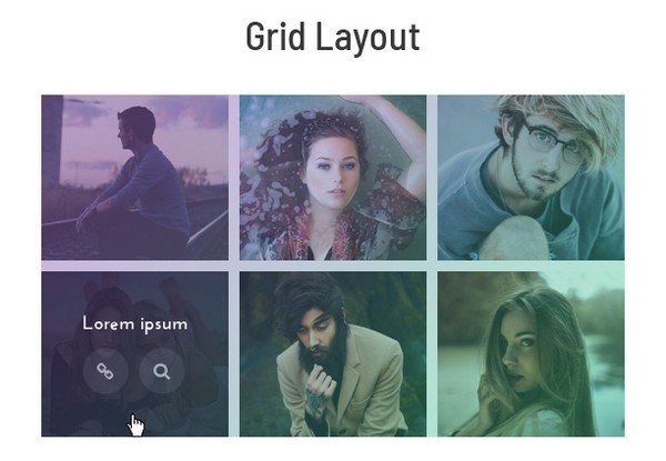
A modular grid uses columns and rows to make many small boxes. These boxes are called modules. Designers can place content inside one box or across many boxes.
This grid is great for dashboards, magazines, product pages, and portfolios. It keeps many items under control.
Imagine a music app. Album covers, song titles, playlists, and buttons all need space. A modular grid keeps them tidy. One album may take four modules. A small button may take one. Everything lines up.
Best for: content-heavy layouts, online shops, news pages, admin panels.
2. Baseline Grids: The Text Whisperer
A baseline grid is all about text. It uses horizontal lines to make text sit in a steady rhythm. The lines are often invisible. But they help paragraphs, captions, and headings feel connected.
This is useful when a design has lots of reading. Think blogs, reports, eBooks, and editorial pages.
When text follows a baseline grid, it feels calm. Your eyes do not jump around. Reading becomes easier. The page feels more professional, even if users cannot explain why.
It is like a metronome for words.
3. Asymmetrical Grids: The Cool Rule Breaker
Not every layout needs perfect balance. Sometimes, perfect balance feels too safe. An asymmetrical grid creates energy by giving one side more weight than the other.
For example, a large photo may sit on the left. A small headline and button may sit on the right. The layout is not equal, but it still feels planned.
This works because the grid is still there. It is just more playful.
Best for: fashion sites, creative portfolios, landing pages, event pages, and bold campaigns.

4. Hierarchical Grids: The Bossy But Helpful Grid
A hierarchical grid is built around importance. It does not always follow equal columns or rows. Instead, it asks one big question: What should users see first?
The most important item gets the biggest space. The next item gets less space. Smaller details follow after.
This grid is common on homepages. A hero section may be huge. Below it, three feature cards may be smaller. Then testimonials may be smaller still.
This creates a clear path. Users know where to look. They do not need to think too hard. That is always a win.
5. Compound Grids: The Grid Sandwich
A compound grid combines two or more grids. Yes, grids can have friends.
A designer may use a 12-column grid for the main layout. Then they may use a modular grid inside a product section. They may also use a baseline grid for the text.
This sounds complex. But it is very practical. Large websites often need different systems for different areas. One simple grid may not fit everything.
For example:
- The header may use a simple column grid.
- The hero section may use an asymmetrical grid.
- The product area may use a modular grid.
- The blog section may use a baseline grid.
All these grids can work together. The result feels rich, but not chaotic.
6. Responsive Grids: The Shape Shifter
A responsive grid changes based on screen size. It helps layouts work on desktops, tablets, and phones.
On a desktop, a page may show four cards in one row. On a tablet, it may show two. On a phone, it may show one. Same content. Different arrangement.
This is vital today. People jump between devices all day. A layout must stay useful everywhere.
A smart responsive grid protects spacing, readability, and touch areas. Buttons stay easy to tap. Text stays readable. Images do not smash into each other like bumper cars.
7. Masonry Grids: The Pinterest Style
A masonry grid stacks items of different heights. The columns stay aligned, but the cards can be tall or short. It feels natural and lively.
This grid is popular for galleries, mood boards, recipes, and image-heavy pages. It saves space and keeps visual interest high.
But it needs care. If the order matters a lot, masonry can confuse users. So designers use it best when browsing is more important than reading in order.

How Special Grids Improve Layouts
Advanced grids do more than make things pretty. They improve how people use a design.
- They reduce confusion. Users can scan faster.
- They increase focus. Important items stand out.
- They create trust. Order feels professional.
- They support speed. Designers reuse patterns faster.
- They help teams. Everyone follows the same structure.
Think of a checkout page. If form fields, prices, shipping options, and buttons are scattered, users may leave. A strong grid keeps the path clear. Name here. Address there. Total on the side. Button below. Easy.
Simple Tips for Using Advanced Grids
You do not need to become a grid wizard overnight. Start small.
- Pick the main goal. Is the page for reading, shopping, browsing, or signing up?
- Choose a grid that fits. Use modular for many items. Use baseline for text. Use hierarchy for landing pages.
- Respect spacing. Gaps matter. They give content room to breathe.
- Break the grid on purpose. A big image or bold quote can add drama.
- Test on mobile. A beautiful desktop grid can fail on a small phone.
The Fun Part: Grids Can Be Creative
Some people think grids limit creativity. Not true. Grids are more like a drumbeat. Once the rhythm is set, designers can dance on top of it.
A designer can make one image huge. They can offset a headline. They can let cards overlap. They can use empty space as a design element. The grid keeps the wild ideas from becoming a mess.
Structure gives freedom. That is the magic.
Final Thoughts
Special grid systems are not scary. They are tools. They help designers arrange content with purpose. They make layouts cleaner, smarter, and easier to enjoy.
A simple grid is a good start. But advanced grids open more doors. They help with complex websites, rich apps, bold brands, and smooth mobile experiences.
So next time you see a beautiful page, look closer. Behind the colors and images, there may be a hidden grid doing quiet hero work. It is not shouting. It is just holding everything together like a tiny design superhero.