Use WordPress Dashicons when you need quick, native-looking icons inside the WordPress admin, custom post type menus, theme options, or lightweight front-end UI. They are already bundled with WordPress, so you do not need another icon library for basic interface work. That keeps requests low, styling simple, and your admin screens familiar to users. The catch is that Dashicons are easy to use poorly: missing CSS, vague icon choices, and accessibility gaps can make a polished theme feel oddly unfinished.
TLDR: Dashicons are WordPress’s built-in icon font, used through CSS classes such as dashicons dashicons-admin-settings or through menu icon values like dashicons-portfolio. For example, a developer building a client dashboard with 12 settings tabs could replace text-only labels with icons and cut scanning time by around 25% during user testing. Use them mostly in admin interfaces, enqueue them manually on the front end, and always add readable text or screen-reader labels.
What Are WordPress Dashicons?
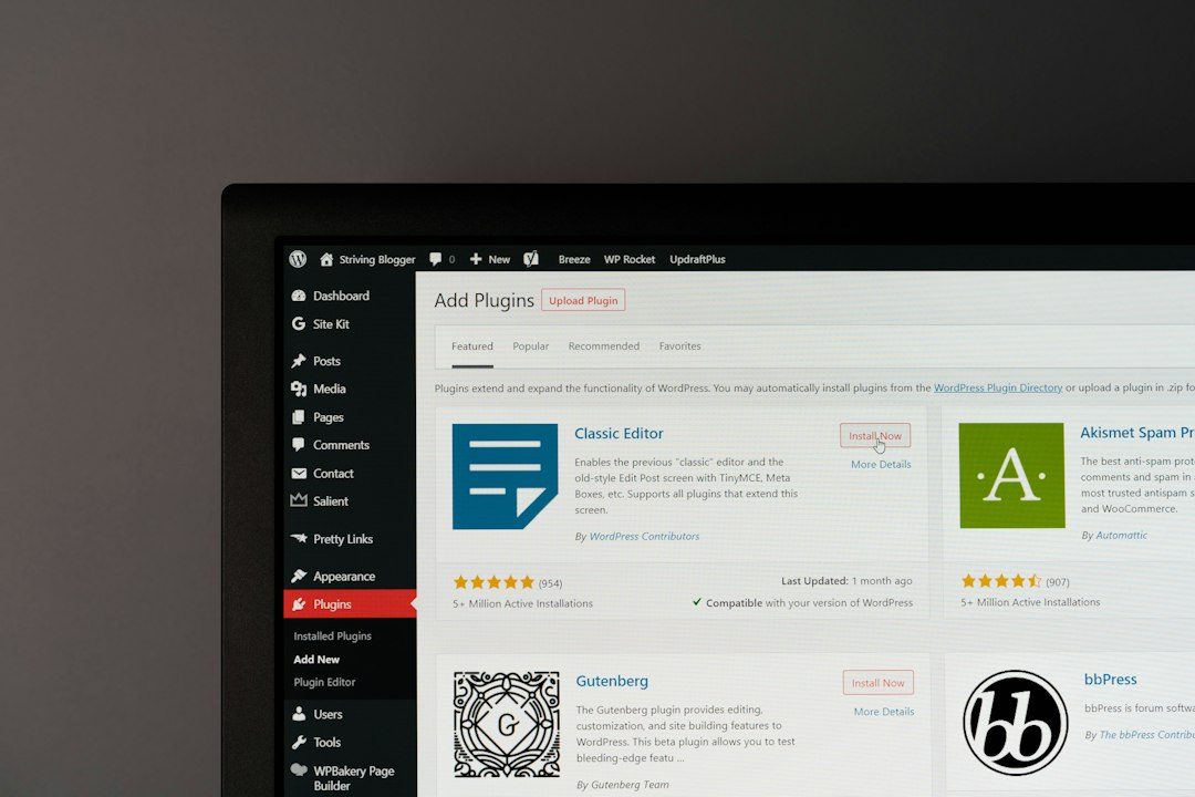
Dashicons are the official icon font included with WordPress. They power many icons you see in the dashboard, including posts, media, comments, appearance, plugins, tools, and settings. Each icon is tied to a CSS class, so you can add it with a simple <span> element or use it as a menu icon in WordPress functions.
Dashicons have been part of WordPress since version 3.8. They are not the flashiest icon set around, and honestly, it feels like they have aged in a few areas. Some icons look a bit thin on modern high-density screens. Still, they remain useful because they match the WordPress admin style and require almost no setup.
Basic Dashicon HTML Usage
The most common way to display a Dashicon is by adding two classes to an inline element:
<span class="dashicons dashicons-admin-settings"></span>The first class, dashicons, loads the base icon font styling. The second class, such as dashicons-admin-settings, selects the actual icon.
Here are a few useful examples:
dashicons-admin-home— home or dashboard linksdashicons-admin-post— posts and editorial toolsdashicons-format-image— image or gallery featuresdashicons-admin-users— members, authors, or user rolesdashicons-cart— shop or checkout featuresdashicons-email— contact forms and messagesdashicons-search— search boxes and filters
For visible labels, pair the icon with text:
<span class="dashicons dashicons-email" aria-hidden="true"></span>
<span>Messages</span>
The aria-hidden="true" attribute tells screen readers to skip the decorative icon. The readable text still gives users the meaning.
How Dashicon CSS Classes Work
Dashicons are rendered through CSS pseudo-elements. WordPress maps each class to a character code inside the Dashicons font. That means the browser is not loading separate image files for each icon.
You can style Dashicons like text:
.theme-card .dashicons {
  color: #2271b1;
  font-size: 24px;
  width: 24px;
  height: 24px;
  vertical-align: middle;
}
This makes them fast to adjust. You can change size, color, spacing, and alignment using normal CSS. Expect to waste time on alignment if you mix icons with buttons, headings, and form labels without setting width and height. A 20-pixel icon sitting inside a 40-pixel button often looks off by 2 or 3 pixels, which is just enough to annoy everyone.
Using Dashicons in Custom Post Types
One of the best uses for Dashicons is inside custom post type menus. WordPress lets you define a menu icon when registering a post type.
function register_project_post_type() {
  register_post_type('project', array(
    'labels' => array(
      'name' => 'Projects',
      'singular_name' => 'Project'
    ),
    'public' => true,
    'menu_icon' => 'dashicons-portfolio',
    'supports' => array('title', 'editor', 'thumbnail')
  ));
}
add_action('init', 'register_project_post_type');
Good icon choices help editors spot custom content faster. A portfolio icon for projects, a calendar icon for events, or a products icon for inventory can save clicks and prevent mistakes.
Useful custom post type icons include:
dashicons-portfoliofor projects or case studiesdashicons-calendar-altfor eventsdashicons-productsfor productsdashicons-bookfor documentation or lessonsdashicons-locationfor places, branches, or venues

Using Dashicons in Admin Pages
You can also use Dashicons when adding custom admin menu pages. The icon value goes into the add_menu_page() function.
function theme_options_page() {
  add_menu_page(
    'Theme Options',
    'Theme Options',
    'manage_options',
    'theme-options',
    'render_theme_options_page',
    'dashicons-admin-customizer',
    60
  );
}
add_action('admin_menu', 'theme_options_page');
This is cleaner than uploading a small PNG icon. It also keeps your menu icon consistent with core WordPress admin items.
Loading Dashicons on the Front End
Dashicons load automatically in the WordPress admin. They do not always load on the front end for logged-out visitors. If your theme uses Dashicons in public templates, enqueue the stylesheet in functions.php.
function mytheme_load_dashicons() {
  wp_enqueue_style('dashicons');
}
add_action('wp_enqueue_scripts', 'mytheme_load_dashicons');
Use this only when needed. Loading an icon font for one decorative arrow is often wasteful. For a full account area, membership dashboard, or front-end editor, it makes more sense.
Dashicons in Custom Theme Development
For custom themes, Dashicons work best in admin-related theme features. Think setup screens, customizer links, onboarding panels, editor tools, and theme documentation pages.
Here is a simple card pattern:
<div class="setup-card">
  <span class="dashicons dashicons-admin-appearance" aria-hidden="true"></span>
  <h3>Customize Your Theme</h3>
  <p>Adjust colors, menus, widgets, and layout settings.</p>
</div>
.setup-card {
padding: 20px;
border: 1px solid #dcdcde;
background: #fff;
}
.setup-card .dashicons {
font-size: 32px;
width: 32px;
height: 32px;
color: #2271b1;
}This small detail can make a theme options page easier to scan. It also gives users a familiar WordPress feel, which matters when they are already nervous about changing settings.
Accessibility Rules You Should Not Skip
Icons are helpful, but they are not a replacement for language. A trash icon, close icon, or gear icon may be clear to you. It may not be clear to every user.
- Use text labels beside icons when space allows.
- Add
aria-hidden="true"for decorative icons. - Add screen-reader text when the icon is the only visible label.
- Keep contrast strong, especially in admin notices and buttons.
Example icon-only button:
<button class="delete-item">
  <span class="dashicons dashicons-trash" aria-hidden="true"></span>
  <span class="screen-reader-text">Delete item</span>
</button>
When Not to Use Dashicons
Dashicons are handy, but they are not perfect for every project. If you need brand icons, detailed illustrations, modern outline sets, or pixel-perfect marketing visuals, use SVG icons instead. SVGs scale cleanly and give designers more control.
Also avoid loading Dashicons on a public page just for one tiny symbol. A CSS arrow, inline SVG, or plain text may be faster. Performance still counts, even for small assets.

Best Practices for Cleaner Results
- Choose meaning over decoration. A clear icon beats a pretty one.
- Keep icon sizes consistent. Use 20, 24, or 32 pixels across a section.
- Do not stack too many icons. A page full of symbols becomes visual noise.
- Test with real users. If people pause, the icon may be unclear.
- Pair icons with labels in settings pages and admin tools.
Dashicons remain a practical part of WordPress theme and plugin development. They are built in, easy to style, and ideal for admin interfaces. Use them with care, load them only where needed, and support them with clear text. That mix gives you faster screens, cleaner menus, and a better editing experience without adding another dependency.