Perfection has no limits! In regards to every brunch, but when we talk about web-design limits of perfection become endless.
The crucial role in web-design applies to the tables, which contain useful information, but which aren’t always adapted both to desktop and mobile devices in a proper way.
The Effectuality of WP Table Plugins
The main task of WP table plugins is to adapt the tables, which are in the structure of the web-pages to the structure of the site as well as to the monitors, which Internet-viewers use. Looking through the tables users of mobile-devices often meet different problems and don’t have convenient access to the content of the tables. Their monitors aren’t large in size so that some part of the table isn’t visible. It can lead to the loss of mobile users and the decreasing of the Internet-traffic as result.
The webmasters couldn’t presume the loss of traffic. The right solution would be the adaptation of the tables to each device, which the viewers use for Internet-connection either note-books, computers or mobile phones.
Thought out to the last detail WP table plugin resolves the issue of table adaptation to the size of the screen. Effortlessly the tables would change their sizes and automatically adapt the columns due to the size of the users’ screens. All the information in the table and the structure of the table would be displayed in the proper way at each monitor.
These innovations would attract more broaden the audience and earn the loyalty of the Internet-users.
Two ways of developing of effectual WP table plugins are known: to add HTML codes manually and with the help of the plugins. You can also read how to make responsive pricing table here. If there are many tables on your site. It’s better to install the plugin and then automatically create many tables with individual design. But, if you add tables rarely, you can do it using HTML codes. If you’re going to add manually – the optimal way is to set breakpoints.
Using HTML codes you could make tables scrollable and stackable. Horizontal scroll method helps you to remain a table viewable with no need to scroll the monitor of the mobile device. After installing the control point your text wouldn’t be smeared out. When the monitor crosses the control point, one can scroll the table.
How to manage HTML Tables
The code, which is below, helps you add a responsive table design to your web-resource without installing any plugins:
<div class=”table-responsive” style=”max-width: 100%; overflow: auto;”>
<table>
——
</table>
</div>
We add code <div class=”table-responsive” style=”max-width: 100%; overflow: auto;”> before the tag <table> and </div> we add after the tag </table> (at the end of our table).
We offer to you real instance of the table which was added with HTML code, using the method described above:
Table 1. Students’ Marks
| Students | Math | Economics | Marketing | History | Management |
| Beake | 8 | 12 | 9 | 10 | 11 |
| Bolton | 12 | 11 | 12 | 9 | 8 |
| Colton | 7 | 8 | 6 | 9 | 7 |
| Dixon | 11 | 8 | 9 | 12 | 10 |
One could reduce the size of the screen and scroll the Table 1.
How to Make Responsive Tables with Data Tables Plugin
There is also another method to make your table responsive. For this, you need to install to WP web-resource Data table maker plugin by Supsystic. It’s not difficult to manage with the settings of this plugin.
Choose Setting tab and set the responsive mode in the Features section of it:
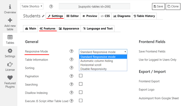
The possibilities of Data Table maker:
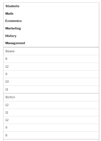
- Standard Responsive Mode – The columns are set under each other to display all table content
For instance, you can make the same table as Table 1, mentioned above, by this plugin, and choose the Standard Responsive mode. In mobile-device monitor the table would be displayed by such a way:
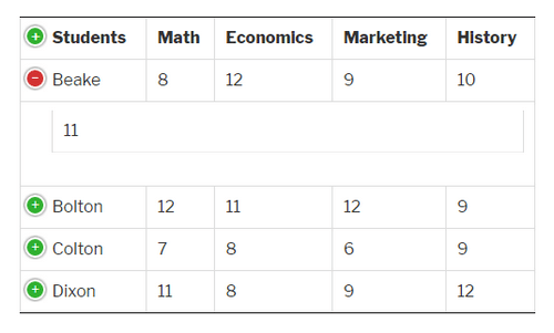
- Automatic Column Hiding – Columns collapse from one side to another (right-left) to display the content of the table. It’s enough to press “+” icon and all the missed columns would become visible.
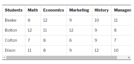
- Horizontal Scroll – Scrolling the bar rectifies the table container width. The user could see the table with scrolling as an invariant of add HTML codes manually, described above.
- Disable Responsivity. Switching this option on, you see the table in full without responsivity. In this way, its size will not be adopted for mobile devices.
When you’ve made the tables using this plugin you are to copy shortcode and insert it into the place of displaying your responsive table design. All the prospective future changes would be possible without a repeated copy of the shortcode. In the topic where you added shortcode the changes would be applied automatically.
The additional advantage of the plugin method is that you can also change table’s design easily, even if you don’t know programming.
How to Add Data Tables to a WordPress Website
In Conclusion
You are welcome to realize all your new ideas and take for a spin the Responsive Table Plugin developed by Supsystic. Furthermore, it broadens your opportunities and opens new horizons. Of course, if your website contains a little number of tables and their sizes aren’t too large it’s easier to add HTML code to each of the pages and make tables manually. In this case, the installation of additional plugins isn’t necessary.
Author Bio: Diana is a digital marketing specialist and she represents Supsystic Team, developing useful WordPress plugins. The Team’s goal is making a contribution to the development of the web space and simplifying the life of WP users.



Comments are closed.