RAW files are like digital cookie dough. They look a little flat at first. But they hold tons of flavor. With the right workflow, you can turn a plain photo into a polished image without wrecking the details.
TLDR: Shoot in RAW, import your photos, make basic corrections, fix color, sharpen, reduce noise, and export for the right use. A wedding photographer might take 2,000 RAW photos, select 600, edit 150, and deliver 80 final images. RAW gives you more control, especially when saving bright skies, dark shadows, and tricky skin tones.
What Is a RAW Image?
A RAW image is an unprocessed photo file. It comes straight from your camera sensor. Think of it as a digital negative.
A JPEG is already cooked. The camera adds contrast, color, sharpening, and compression. A RAW file keeps much more data. That means you can recover more detail later.
RAW files are bigger. They also need editing software. But they are worth it if you want better results.
- More highlight detail in bright areas.
- More shadow detail in dark areas.
- Better color control for skin, skies, and products.
- Non destructive editing in most RAW editors.
Step 1: Import and Organize
Do not start editing in chaos. Chaos is where good photos go to hide.
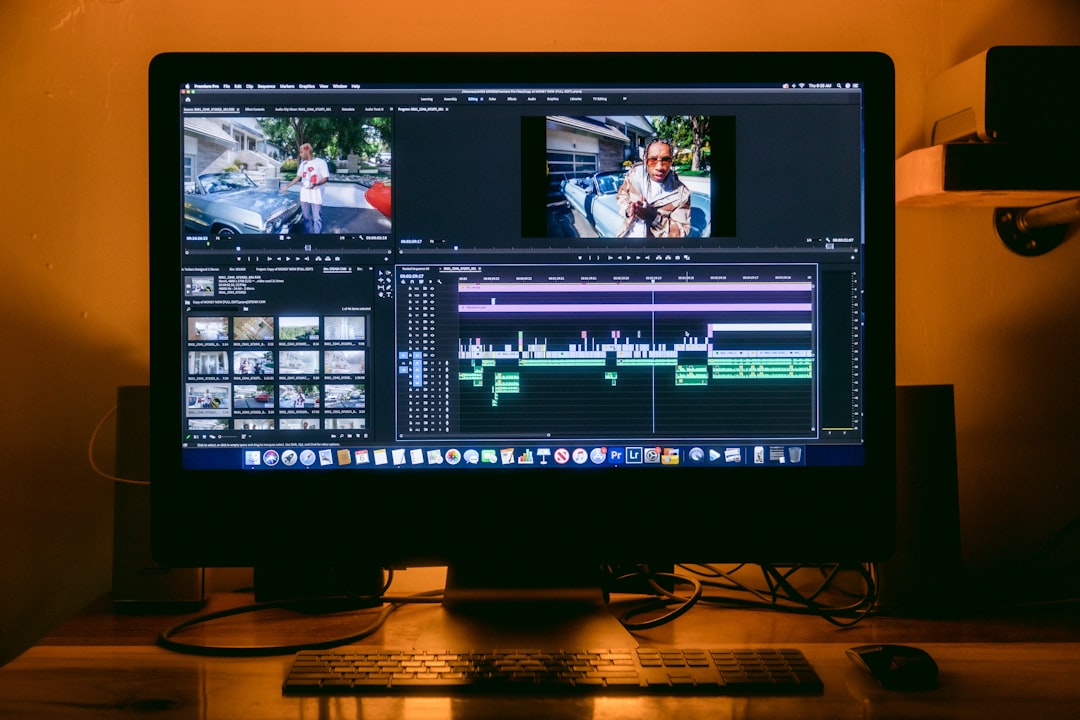
First, copy your RAW files to your computer. Then back them up. Use a simple folder system.
- Year: 2026
- Month: 07 July
- Shoot name: Beach portraits
Add keywords if your software supports them. Use words like portrait, sunset, client, or product. Future you will send present you a thank you card.
Step 2: Cull Like a Pro
Culling means choosing the best photos. It also means saying goodbye to blurry disasters. Be brave.
Go through your shots quickly. Do not edit yet. Just rate them.
- Reject: blurry, closed eyes, bad focus.
- Maybe: good moment, small issues.
- Keep: sharp, strong, useful.
A simple rule helps. If two photos look almost the same, keep the sharper one. If both are sharp, keep the one with better emotion.
Step 3: Start With Lens Corrections
Most RAW editors have lens correction options. Turn them on early.
Lens corrections fix distortion, dark corners, and color fringing. Wide angle photos often bend straight lines. Cheap lenses may show purple edges near contrast. The software can correct much of it with one click.
This step is not glamorous. It is more like brushing your teeth. Small. Boring. Important.
Step 4: Set the Right White Balance
White balance controls color temperature. It decides if your image feels warm, cool, or just plain weird.
If a photo looks too orange, cool it down. If it looks too blue, warm it up. Use the temperature and tint sliders.
You can also click on something that should be neutral gray or white. A white shirt works. A gray wall works. A neon green party hat does not work. It has chosen chaos.
For portraits, focus on skin. Skin should look alive. Not green. Not vampire blue. Not roast chicken orange.
Step 5: Fix Exposure First
Exposure is the overall brightness. Start here before tweaking everything else.
Use these sliders in this general order:
- Exposure: sets the main brightness.
- Highlights: bring back bright skies and shiny areas.
- Shadows: open dark hair, clothes, and backgrounds.
- Whites: set the brightest clean point.
- Blacks: set depth and contrast.
Do not push every slider to 100. RAW files are powerful, not magical. If your photo is five stops too dark, it may still look noisy. If the sky is pure white with no detail, it may be gone forever.
Step 6: Add Contrast and Tone
Now the image should look balanced. But it may still feel flat. That is normal. RAW files often look soft and low contrast.
Add contrast slowly. Use the contrast slider or tone curve. The tone curve is a pro tool, but it is not scary.
A gentle S curve works well. Pull the shadows slightly down. Push the highlights slightly up. Boom. Instant pop.
Use clarity for midtone contrast. Use it carefully on faces. Too much clarity can make skin look crunchy. Nobody wants crunchy cheeks.
Use texture for fine details. It works well on fabric, hair, buildings, and food. It can also make pores shout. Be kind.
Step 7: Control Color
Color is where style begins. This is also where beginners often go wild. Suddenly every sunset looks like lava soup.
Start with vibrance. It boosts weaker colors first. It protects skin better than saturation. Saturation boosts everything. It is loud. It has no chill.
Then use the HSL panel. HSL means Hue, Saturation, and Luminance.
- Hue: changes the color itself.
- Saturation: changes color strength.
- Luminance: changes color brightness.
Want a deeper blue sky? Lower blue luminance a little. Want softer grass? Reduce green saturation. Want better skin? Adjust orange gently.
Step 8: Remove Distractions
Now clean the photo. Remove dust spots, stray hairs, crumbs, exit signs, and that one mysterious sock in the corner.
Use healing or clone tools. Zoom in, but do not live there. If you stare at 300 percent zoom for too long, you will start editing individual atoms.
For portraits, keep skin natural. Remove temporary things like pimples or lint. Keep real features like freckles, smile lines, and character. Real people are not plastic furniture.
Step 9: Sharpen the Image
Most RAW files need sharpening. Your camera has not done much processing yet.
Use sharpening after basic edits. Focus on the important details.
- Portraits: sharpen eyes, lashes, lips, and hair.
- Landscapes: sharpen rocks, trees, and distant detail.
- Products: sharpen edges, labels, and texture.
Use masking if available. Masking keeps sharpening away from smooth areas like skies and skin. This helps avoid noise and rough textures.
Step 10: Reduce Noise
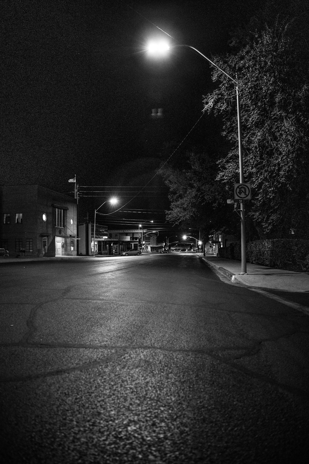
Noise is grainy speckling. It appears in dark photos or high ISO shots. RAW files can handle noise reduction well.
Use luminance noise reduction for brightness grain. Use color noise reduction for colored specks. Do not overdo it. Too much noise reduction makes photos look like melted wax.
A good balance is simple. Reduce noise until it stops distracting you. Then stop. Walk away from the slider.
Step 11: Crop and Straighten
Cropping changes the story. It removes weak space. It also improves composition.
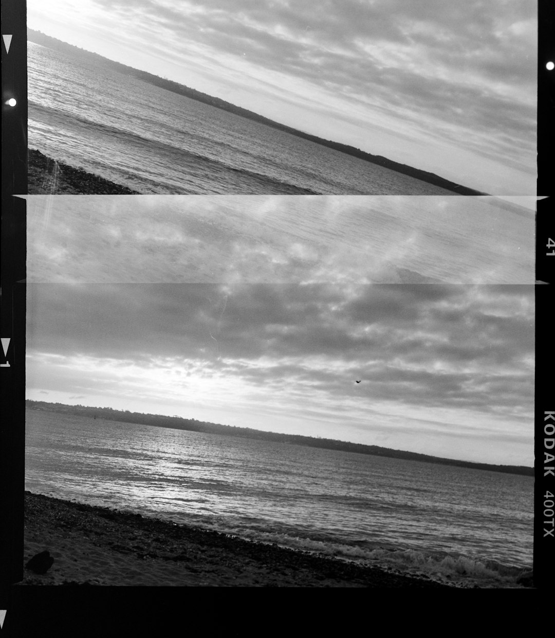
Straighten horizons. A tilted ocean makes viewers feel like the planet is sliding off the table.
Use common crop ratios:
- 1:1 for square social posts.
- 4:5 for vertical social photos.
- 3:2 for standard camera shape.
- 16:9 for screens and banners.
Leave enough space around faces, products, and text areas. Tight crops can feel stylish. Too tight can feel like the photo is trapped in an elevator.
Step 12: Create a Consistent Style
Once your photo looks good, think about style. Style is not just a preset. It is a pattern of choices.
Maybe you like warm highlights and soft shadows. Maybe you like clean whites and true colors. Maybe you like moody tones with deep greens.
Save your settings as a preset if your software allows it. Then use that preset as a starting point. Not a final answer. Every photo still needs small adjustments.
Step 13: Export the Right Way
RAW files are not for delivery. You need to export them into formats people can use.
- JPEG: best for web, social media, and clients.
- TIFF: best for high quality printing or advanced editing.
- PNG: useful for graphics, but not usually photos.
For web use, export in sRGB color space. Set quality around 80 to 90 percent. This keeps files smaller while still looking good.
For print, export at full size. Use high quality settings. Ask the printer what color space and resolution they prefer.
A Simple Beginner to Professional Workflow
- Import and back up your RAW files.
- Cull and rate the best images.
- Apply lens corrections.
- Fix white balance.
- Adjust exposure, highlights, and shadows.
- Add contrast and tone.
- Refine color with vibrance and HSL.
- Remove distractions.
- Sharpen important details.
- Reduce noise carefully.
- Crop and straighten.
- Export for web, print, or client delivery.
Final Thoughts
Processing RAW images is not about making fake photos. It is about revealing what the camera captured. You guide the image from rough data to finished art.
Start simple. Fix light. Fix color. Clean distractions. Export with care. As you grow, you can add curves, masks, local edits, and color grading.
And remember this golden rule: every slider is like hot sauce. A little can be amazing. Too much can ruin dinner.